Irina Gheorghe: Methods for the Study of What is Not There
Methods for the Study of What is Not There brings together a series of rigorously formal drawings composed of rectangular areas of colour that act as studies for the performance piece, Preliminary Remarks for the Study of What Is Not There. These studies are scores for each performance, built up through colour-coded arrangements of tape that categorise non-perceptible entities into a map.
Elements of earlier scores overlap in the exhibition installation and create an idiosyncratic temporality that distorts the gallery interwoven with photographs that show the artist executing gestures that she uses in her performance. Creating an atmosphere of absurdity and alienation in which the applied sign system is debunked as an arbitrary system.
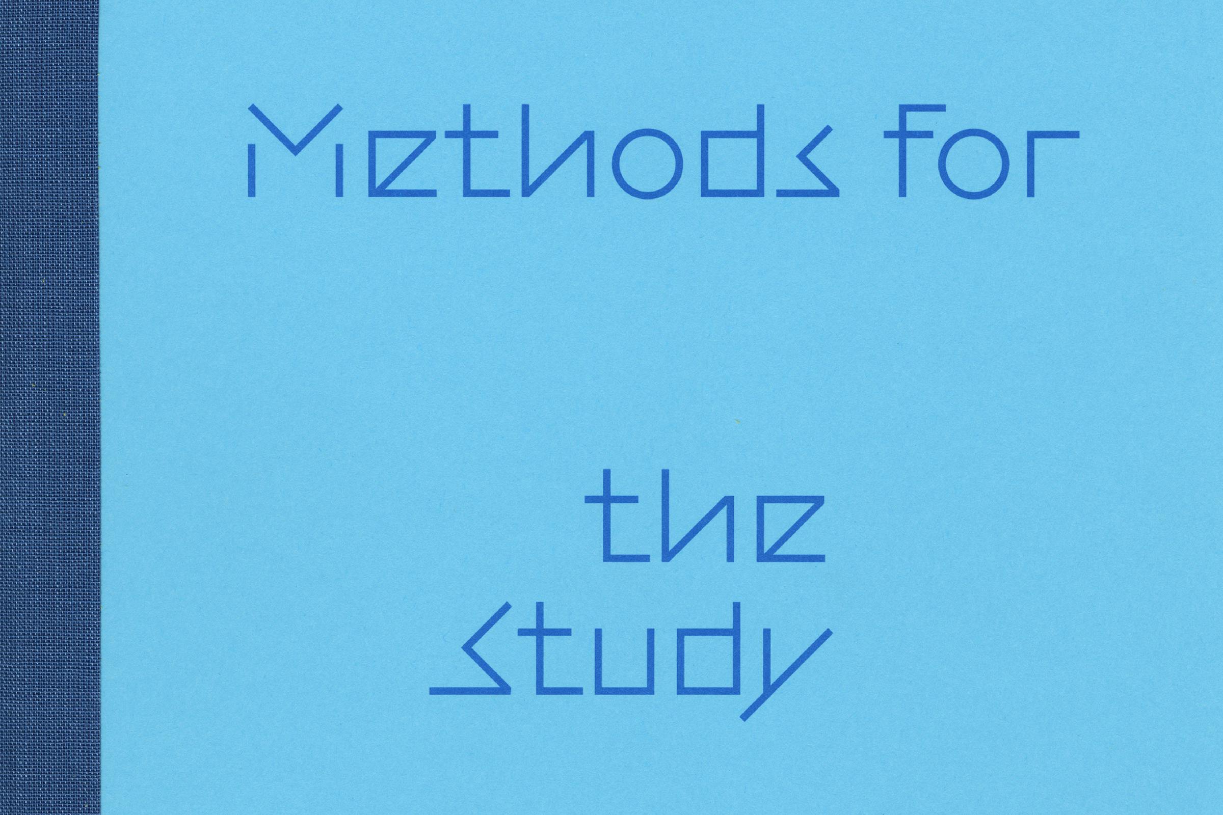
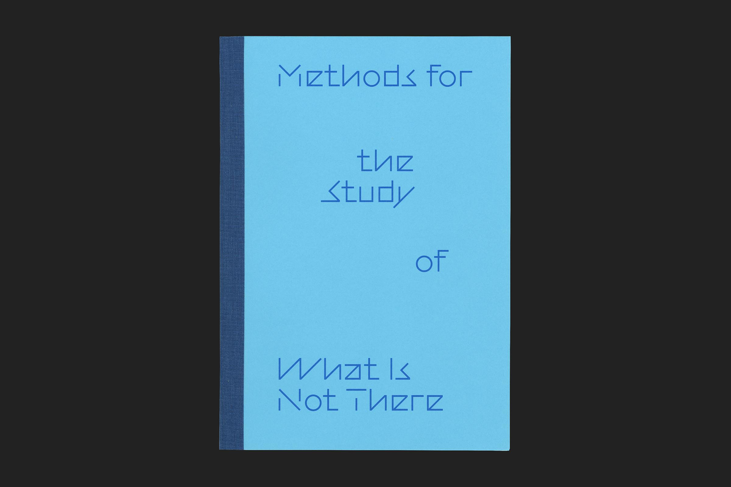
The publication represents an extension of Gheorghe’s notebooks. The cover plays on this, replicating their dimensions. Constructed using a light blue, slightly-waxy, office folder paper stock, overlaid with bright blue text. A strip of book tape covers the saddle stitch binding giving a touch of materiality and nodding to her experimentation with tape as a medium.
Client
Künstler:innenhaus Bremen
Category
Format
169 × 240 mm
Extent
68pp
Binding
Saddle stitched with tape covering
Publisher
Bierke Verlag
Typefaces
Modelo, Regola
Selected as ‘in book’ for small graphics at the Tokyo TDC Annual Awards 2023.
The publication interior consists of a collection of essays printed in blue on a soft yellow paper. Each essay is accompanied by Gheorge’s drawings, interwoven throughout on a textured uncoated white paper and presented at 1:1 scale as if directly removed from her notebooks.
Essays are set in both German and English. The languages are divided by different text block arrangements, two columns for the longer extent of German text, and a central single column for the shorter English. Separated by a central positioned folio figure in the majority of instances, with this moving to the side edges for the Prologue where content fills a single page.
Editor
Nadja Quante
Texts
Maeve Connolly, Ulrieke Gerhardt, Nadja Quante, Marie-France Rafael
Publisher
Bierke Verlag
Body text is set in Regola, a contemporary interpretation of an office typeface. Combining typical aspects of both geometric and grotesque type styles into something that is both legible and characterful.
Titles are set in Modelo by MaxiType, a display typeface inspired by constructivist lettering and early 20th century explorations of sans serif styles. The disconnected strokes compliment the core concepts of the exhibition, allowing the reader to explore the spaces in between.
A simple gallery guide accompanies the exhibition, adapting the publication layout to a single A4 sheet. Printed on a similar material to the book cover, this time in a dusky pink.
Exhibition
25 September – 21 November 2021
Curator
Nadja Quante