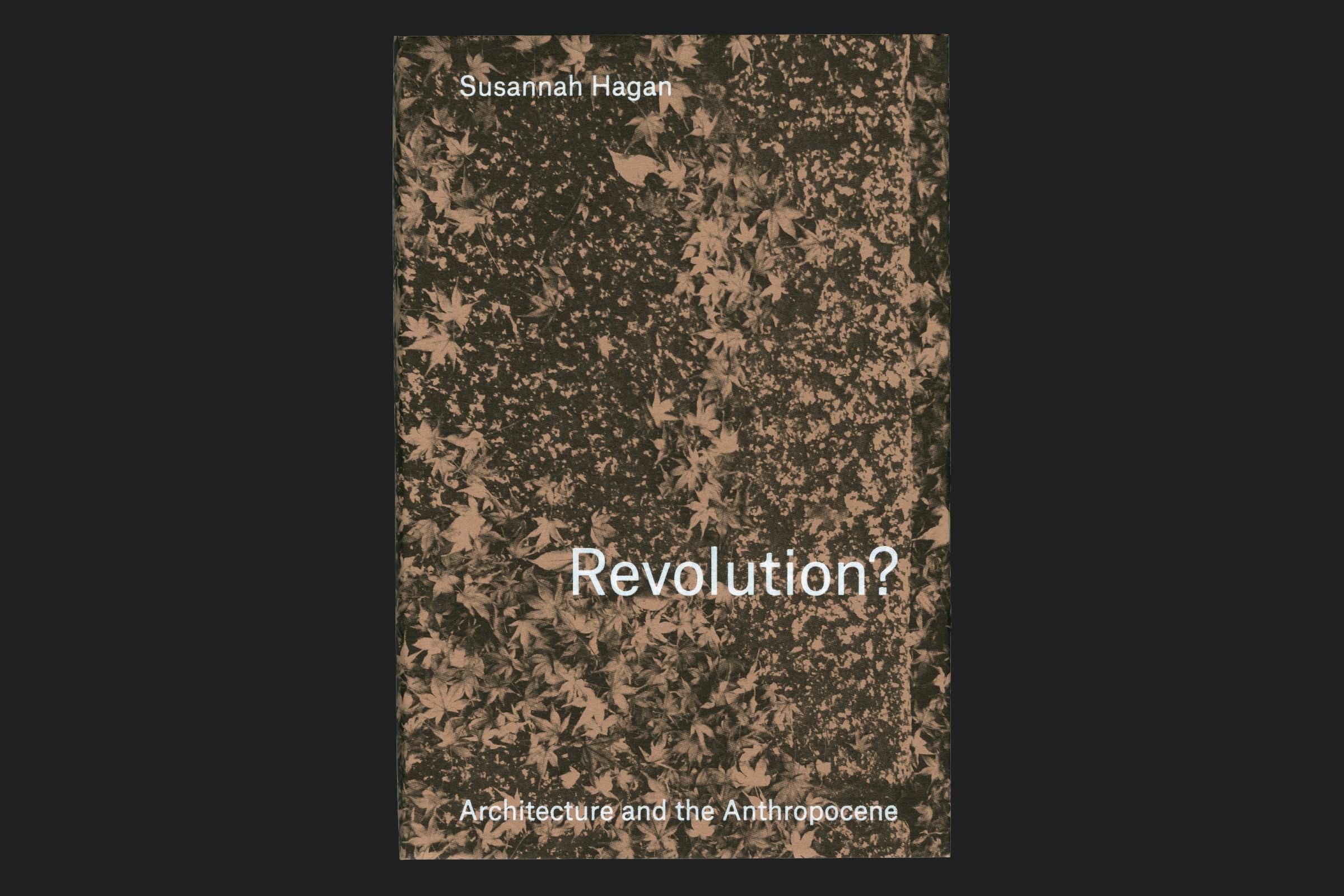
Revolution? Architecture and the Anthropocene
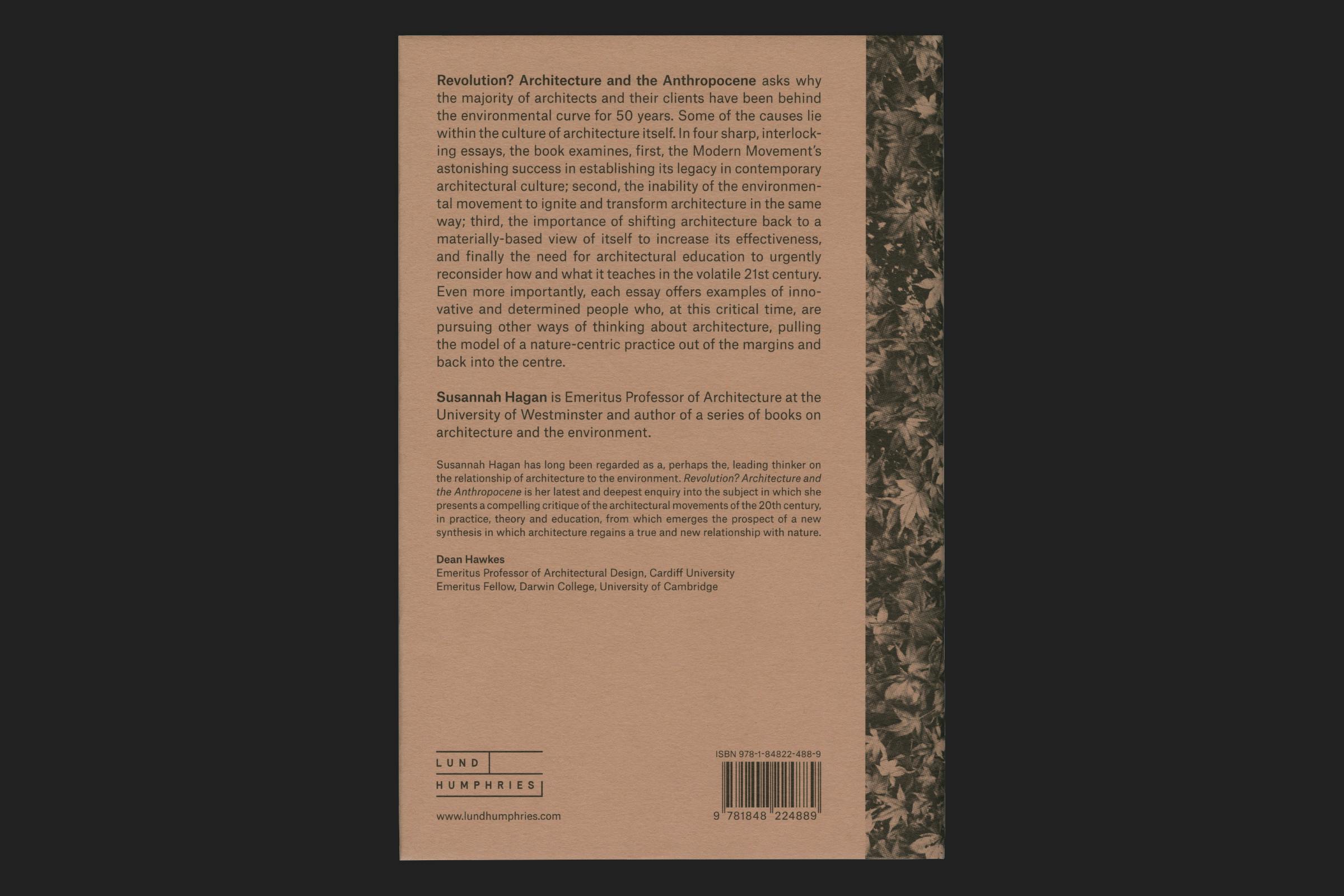
Revolution? Architecture and the Anthropocene is an urgent call to reduce our devastating impact on the Earth that supports us. We have been told since the 1960s that architects are not engaged enough with the environmental consequences of what and how they construct. The usual approach is to propose new ways of designing and building to persuade of the centrality of environmental concerns, but too many have remained resolutely unpersuaded over decades.
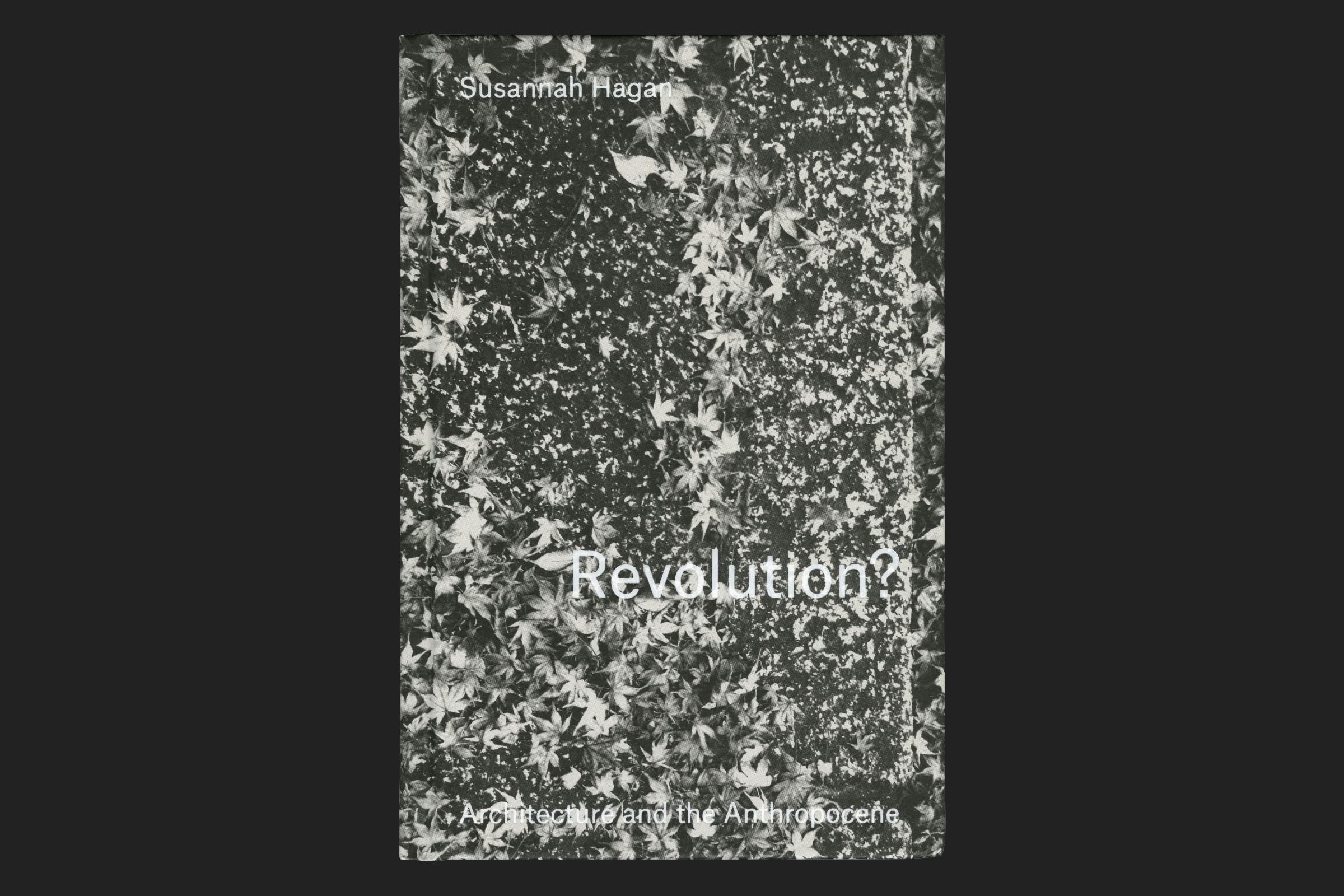
This title explores the inability of the environmental movement to ignite and transform mainstream architecture, and how we need to reconsider our outlook. Taking a holistic approach to the manufacture of the publication through using recycled materials and limiting the print to a single coloured ink, emphasised through the greyscale cover underneath the jacket.
Client
Lund Humphries
Category
Author
Susannah Hagan
Format
135 × 205 mm
Extent
120pp
Binding
Section sewn
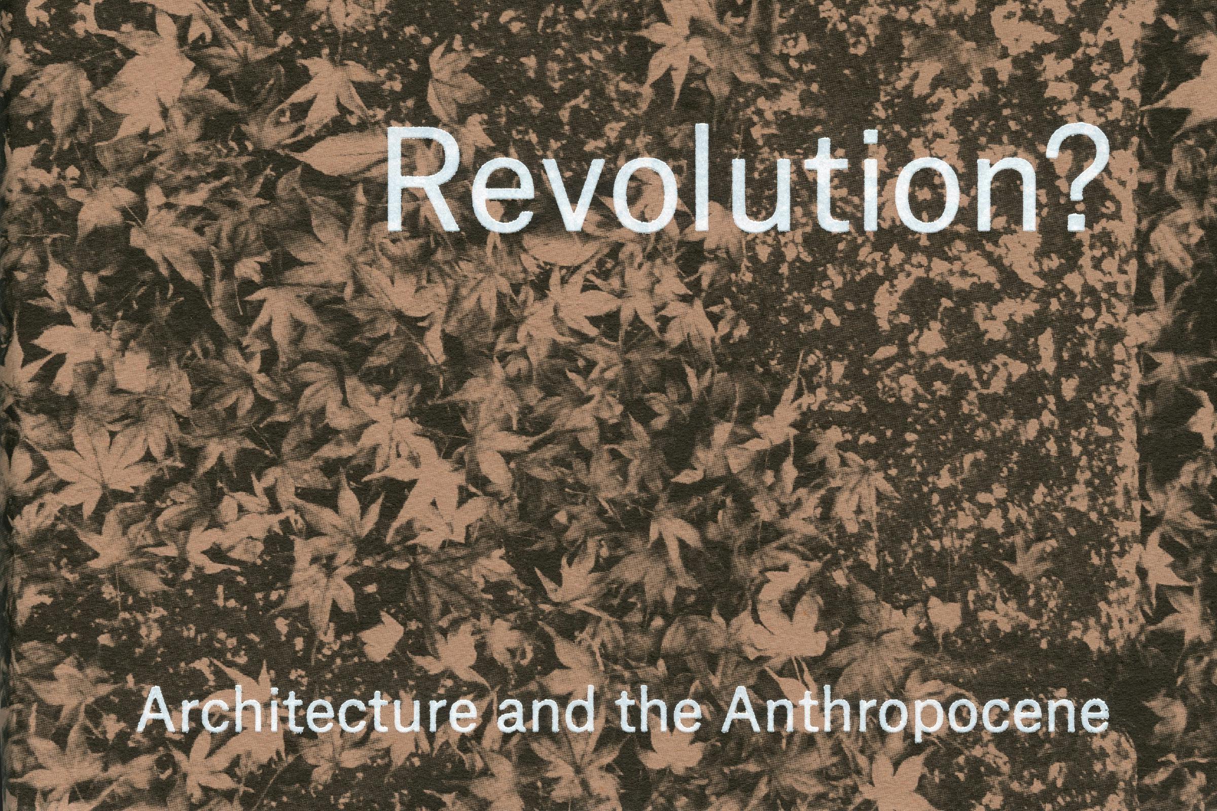
Typeface
Atlas Grotesk
The book is set in bold and regular weights of Atlas Grotesk, a contemporary revival by Commercial Type of the lost typeface Mercator.*
Atlas is a typeface that straddles the line between global styles – taking cues from European neo-grotesques, but with vertical proportions and contrast that have more in common with American gothics. It has an open and friendly character with a visible warmth that is comfortable for extended reading.
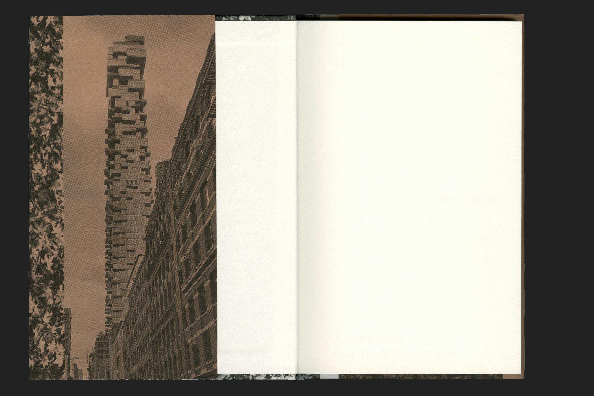
The book layout breaks away from conventional norms with a raised and inset folio, which leads to a wider inner margin giving a sense of space to the page. This sense of spaciousness is further aided through paragraph line breaks to prevent the justified text from appearing too dense.
A warm white uncoated paper stock helps with ease of reading on what is quite a hard-hitting subject.
* Mercator was designed in 1959 by Dick Dooijes and G. W. Ovink at the Amsterdam Type Foundry. It was created as a rival to Helvetica and Univers with a particular Dutch Modernist character. However, the typeface didn’t enter wide circulation or enter into the repertoire of designers and quietly disappeared from the stage with the demise of manual and hot metal typesetting.