Mark di Suvero: Steel Like Paper
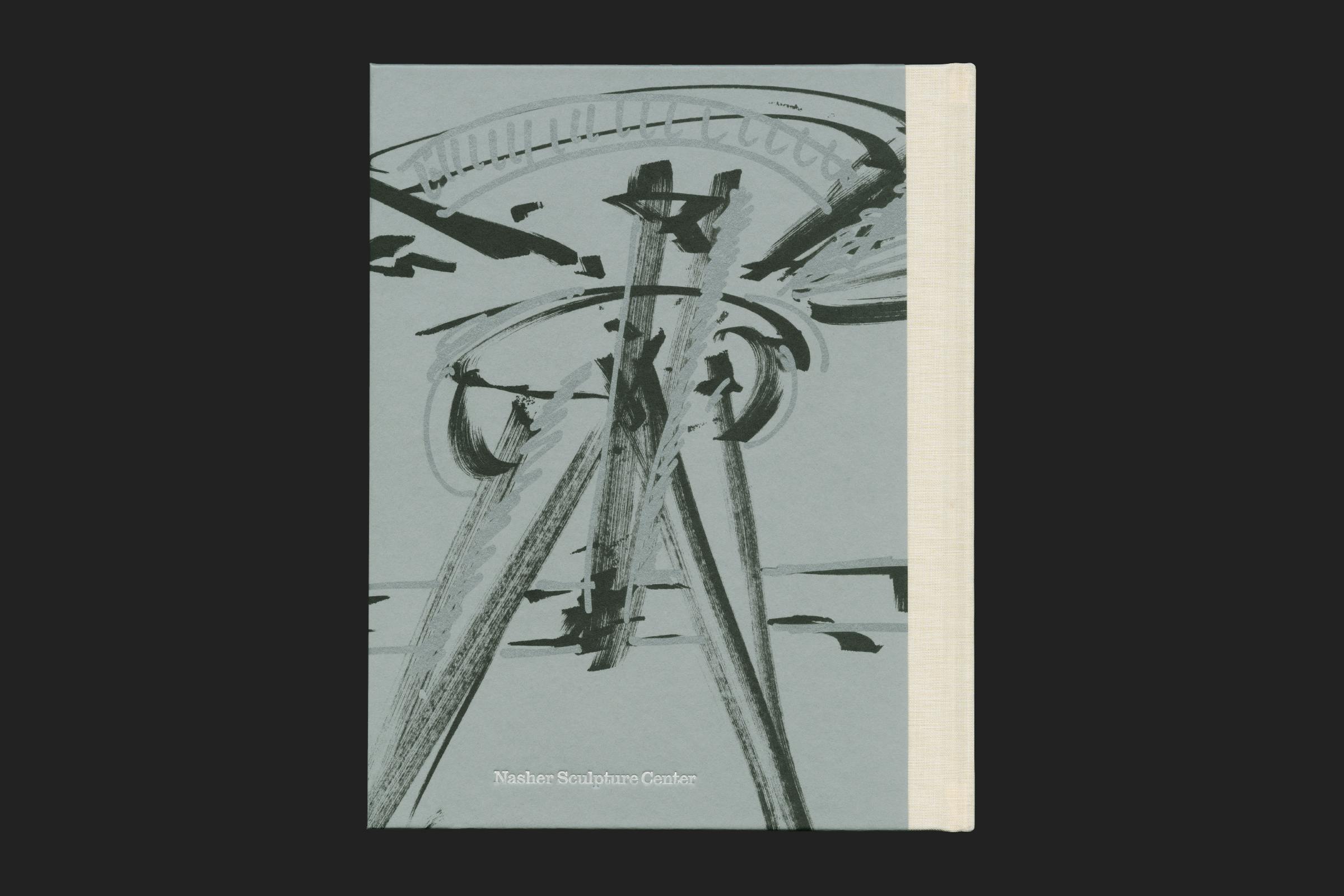
Mark di Suvero is renowned for monumental, abstract, steel constructions that grace urban plazas, bucolic sculpture parks, and public spaces throughout the world. The exhibition at the Nasher Sculpture Center focuses on the artist’s studio practice over the course of his more than six-decade career, surveying the more intimately and modestly scaled sculptures in parallel with his energetic and rarely seen drawings.
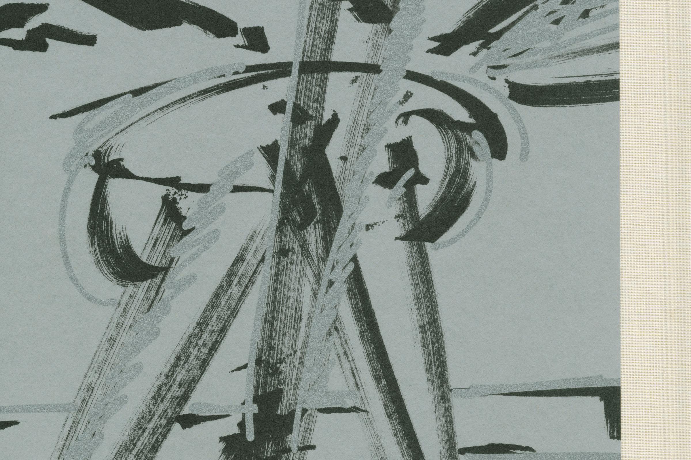
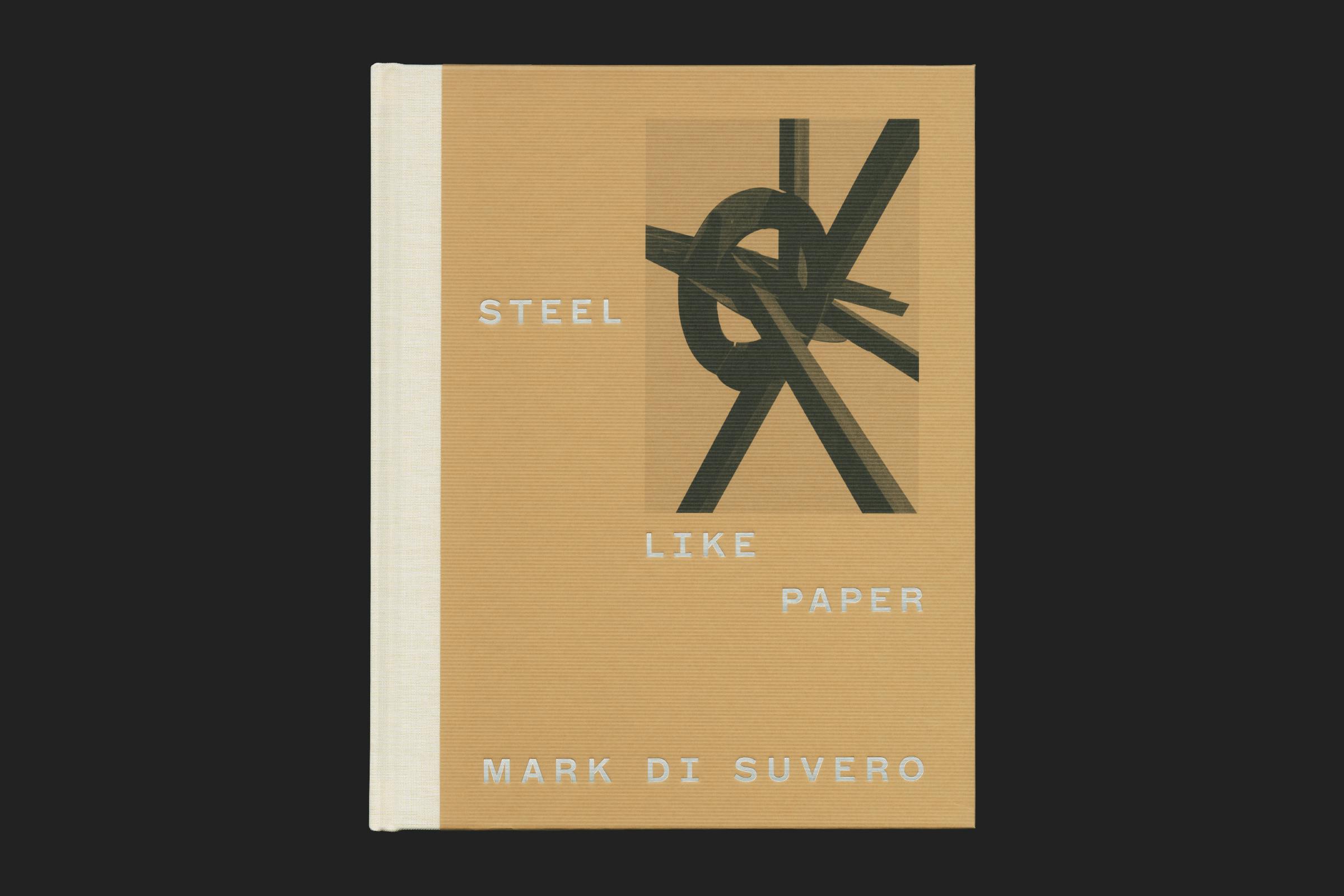
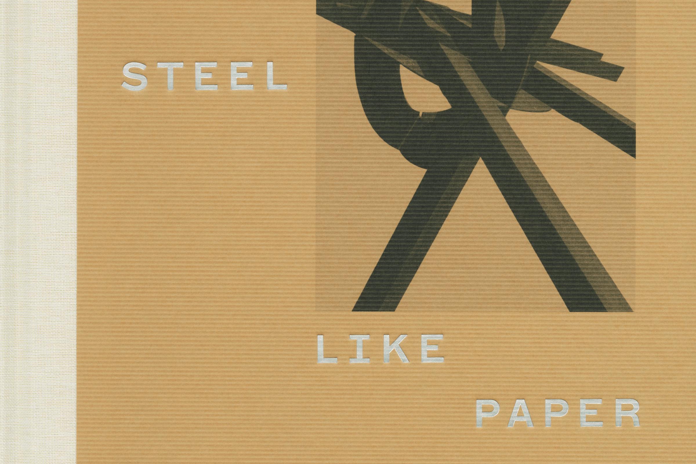
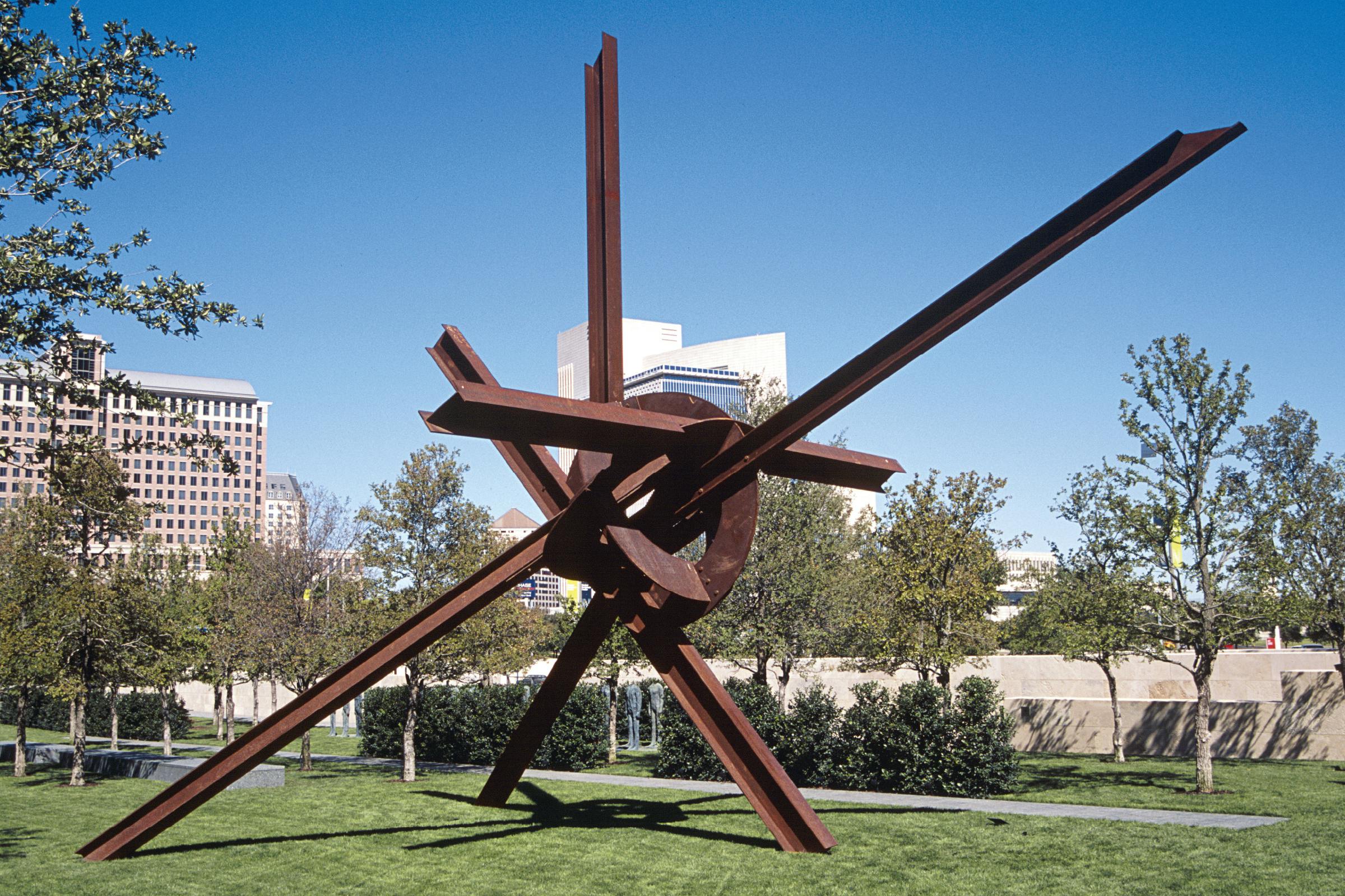
This publication is the most extensive survey of his work in over 30 years, recording the largest US museum exhibition since 1975. Di Suvero has a long-standing relationship with the gallery, which houses the work Eviva Amore (2001) in the garden space. The cover records the construction of this work, with one of the original drawings on the reverse (complete with metallic Pantone print and foil to portray his often-used silver pen), and a detail of the ‘knot’ on the front.
Client
Nasher Sculpture Center
Category
Format
200 × 255 mm
Extent
236pp
Cover
Three-quarter bound hardback
Binding
Section sewn
Finish
Foil, metallic printing, laid-paper, blind embossing
Typefaces
ABC Marfa, ABC Marfa Mono
Selected as a book design winner in the AGAI ‘50 Books / 50 Covers’ competition, 2023.
In reference to the monumental works and his studio practice, di Suvero notes that, for him, plates of steel are like sheets of white paper, suggesting a facility, intimacy, malleability, and limitless potential rarely associated with his obdurate materials. The book uses a range of material on the inside: an uncoated, bulky paper for the text pages, a warm-white matt coated material for the works to bring out detail, and grey steel-like paper for the list of works.
Text layout mimics the hanging structures of di Suvero’s large works – block-like justified text with strong indentation between paragraphs, and an even deeper indentation for quotations. Generous space is left at the top of the page to give a grounded feeling to the layout, and to not overload the page.
Sections are broken up with coloured tip-ins and blind embossed title text – a direct intervention from a metal plate – and an 8 page ‘WORK’ section printed on textured grey textured paper in a dark charcoal Pantone that forms a contents page for the upcoming image plates.
Work titles are in bold rather than italic, playing with the idea of physical presence that the sculpture takes in a space. Other small details include using a cross-barred, steel girder-like ‘I’ in titles and when ‘I-Beams’ are mentioned within the text.
The book is typeset in ABC Marfa, a contemporary take on sturdy, utilitarian American typefaces.
Artwork is presented chronologically through the book, interspersing sculpture and paper, and playing with page arrangement to give a sense of rhythm as you read through the book. Paper works always sit centrally to the page, and sculpture can be either full-bleed, or partially bleeding off of a page depending on the background landscape.
An extended 24 pages of biography and exhibitions celebrates di Suvero’s long career.
The publication has a strong materiality, using thick boards to give the book a heavy weight in the hand. The laid paper references the hand-cut rippled edges of the metalwork on the smaller sculpture, paired with a dark charcoal, recycled, material on the reverse. A cloth spine with bright red foil text brings it all together.
The endpapers flip the cover materials, using the charcoal recycled stock on the front, and the brown on the reverse. The front endpapers are an early study of Eviva Amore printed in metallic Silver ink. The reverse is a photograph of di Suvero working.