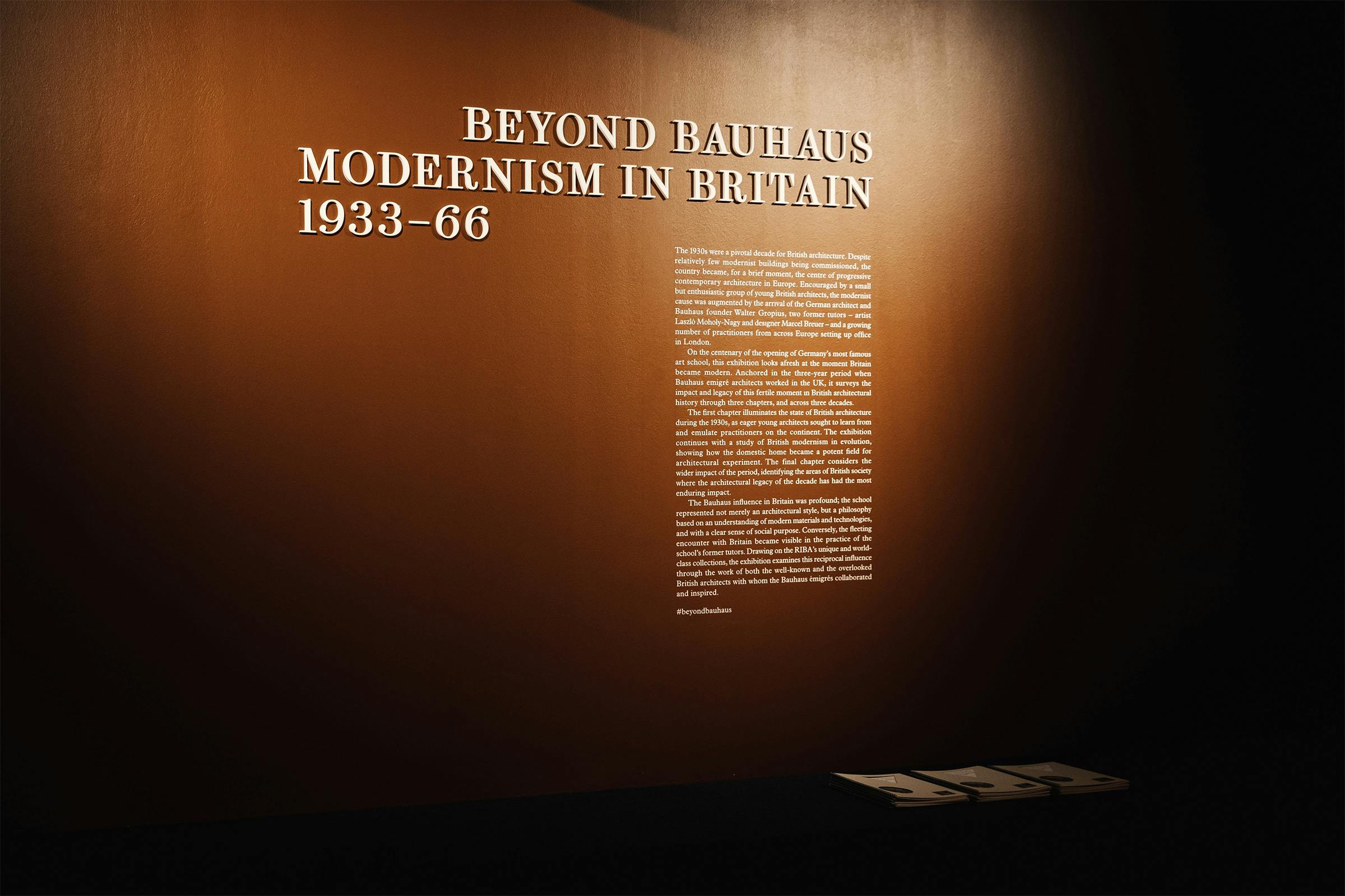
Beyond Bauhaus: Modernism in Britain 1933–66
On the centenary of the opening of the world’s most famous art school, the Bauhaus, this exhibition looks afresh at the effects of modernism on British architecture after three notable émigré’s – Walter Gropius, László Moholy-Nagy and Marcel Breuer – moved to England to escape persecution. While only in the UK for three years, they had a lasting impact on architectural form and helped to shape the modern British landscape as we know it today.
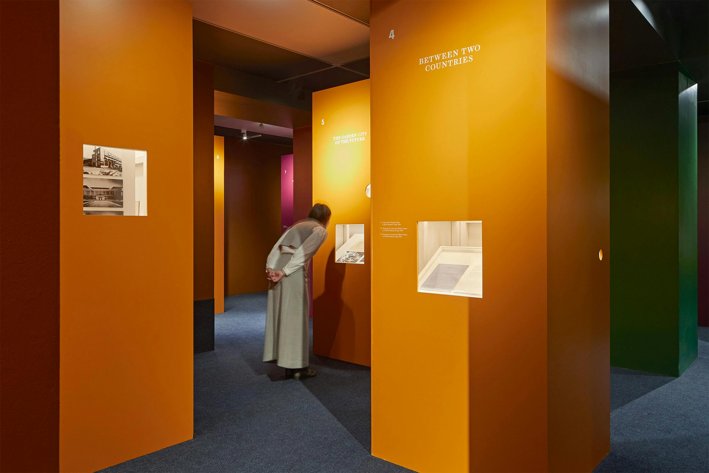
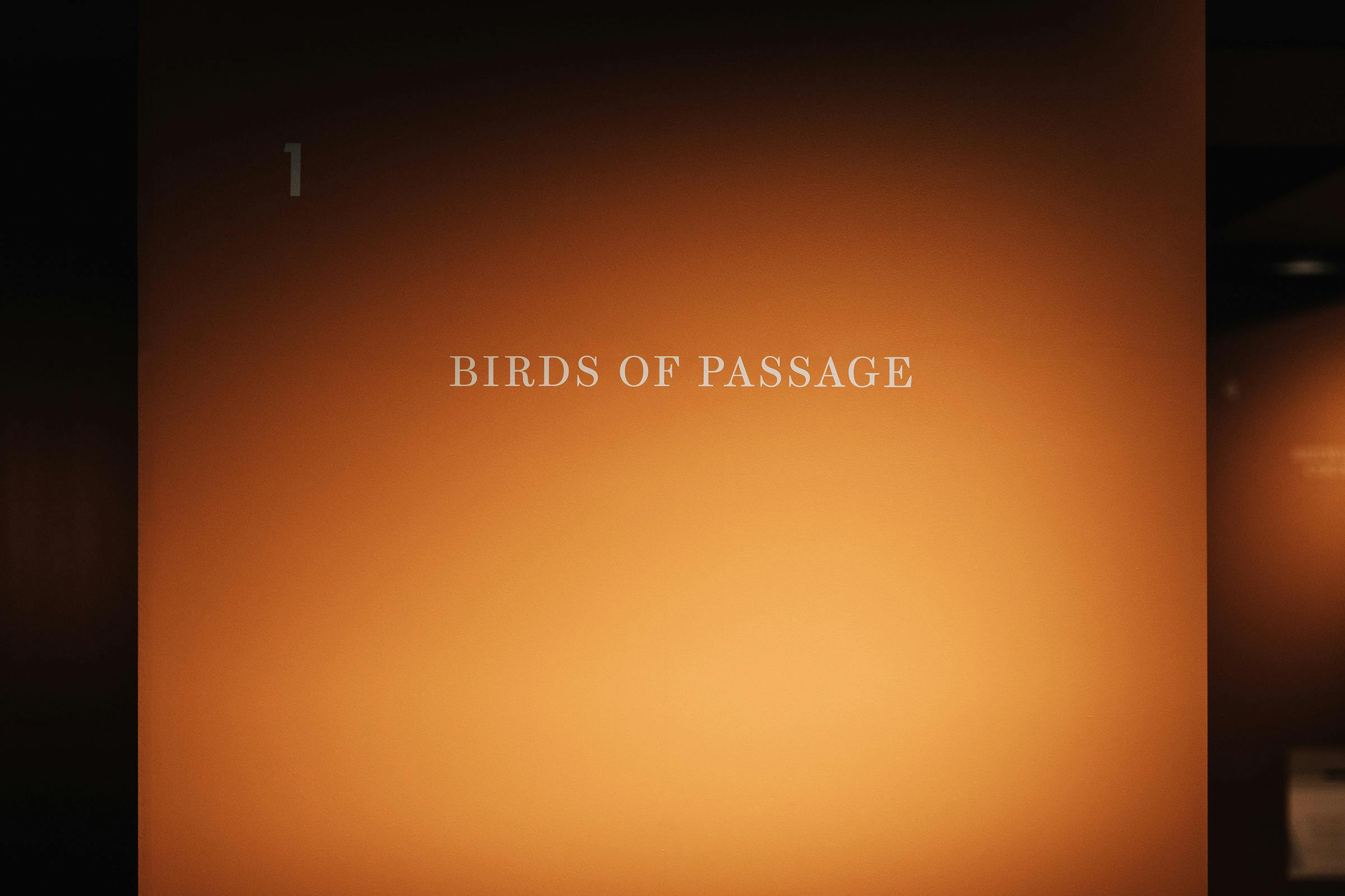
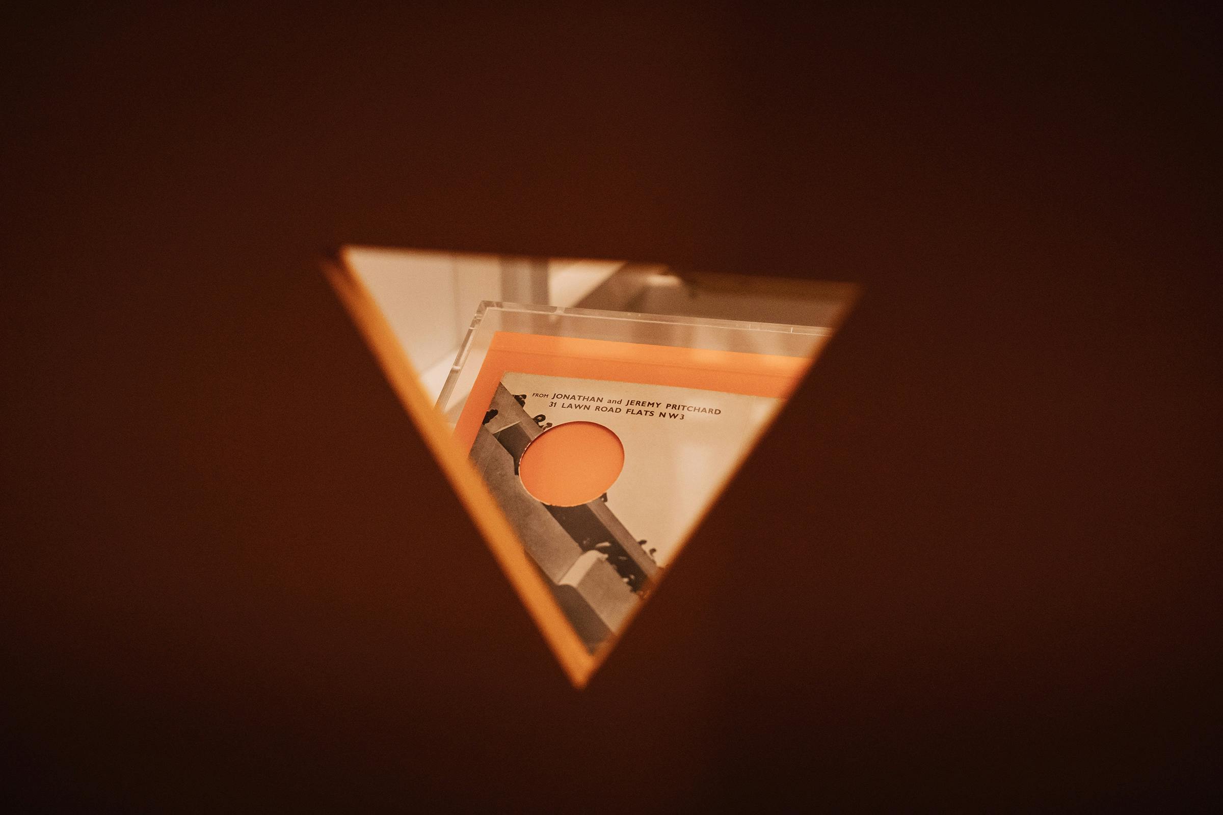
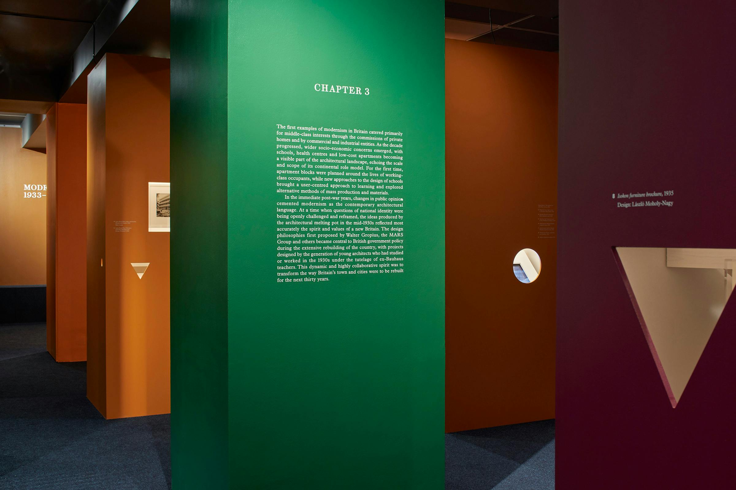
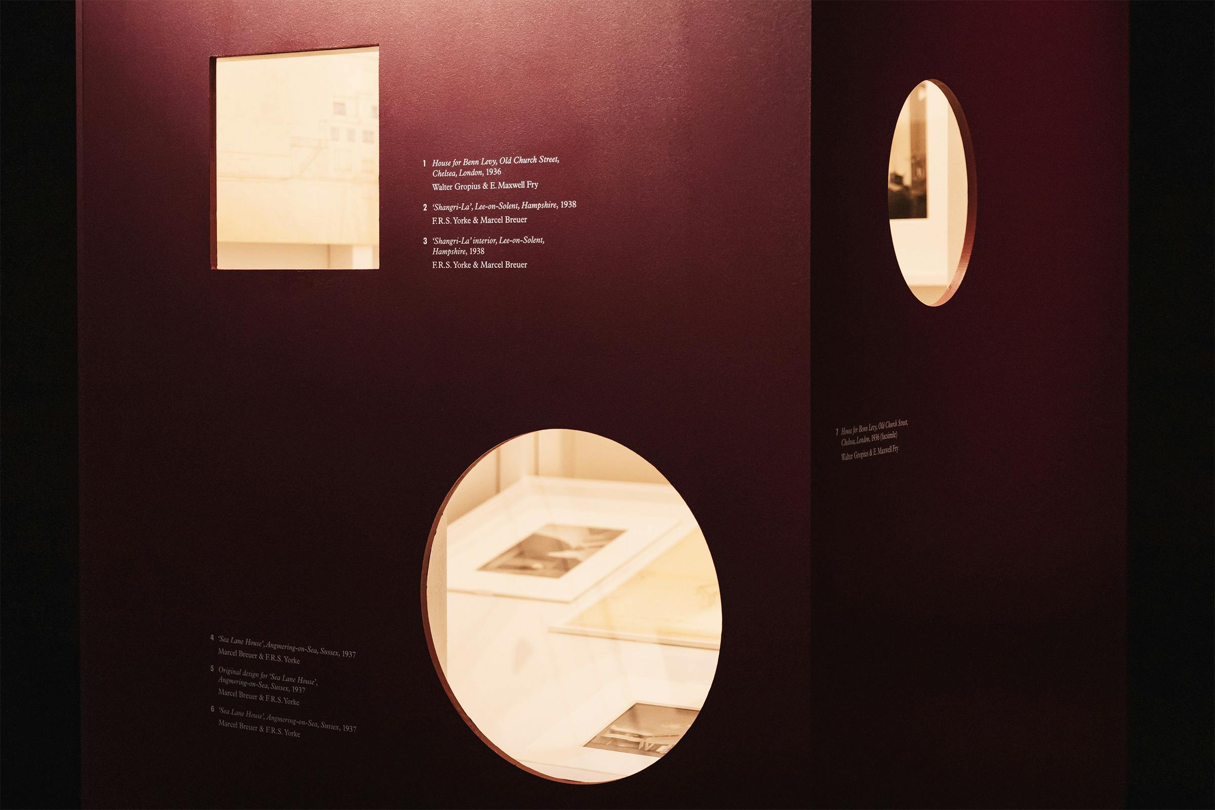
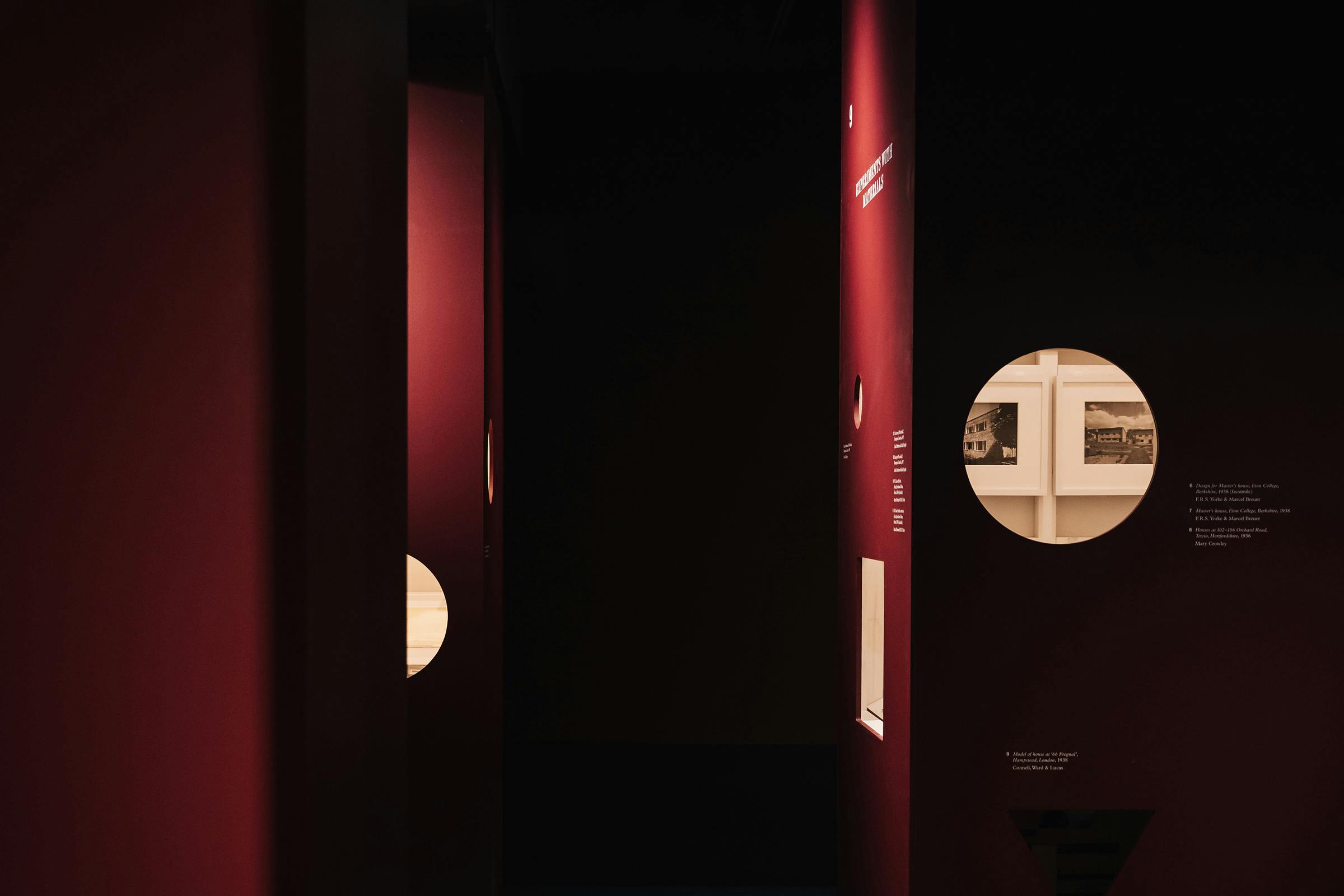
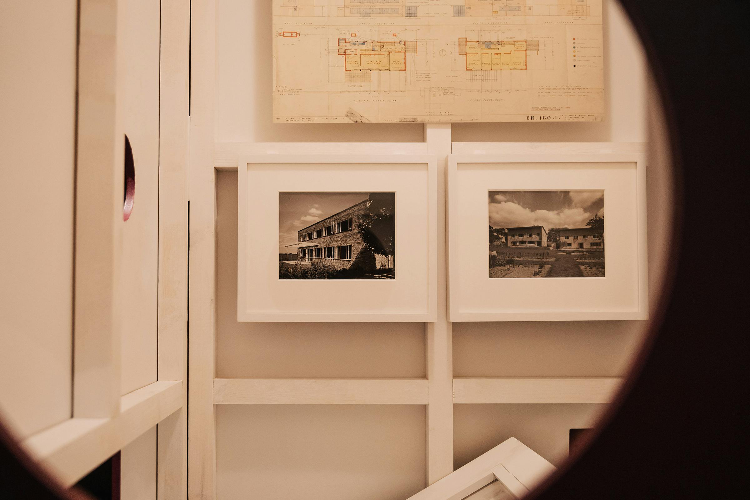
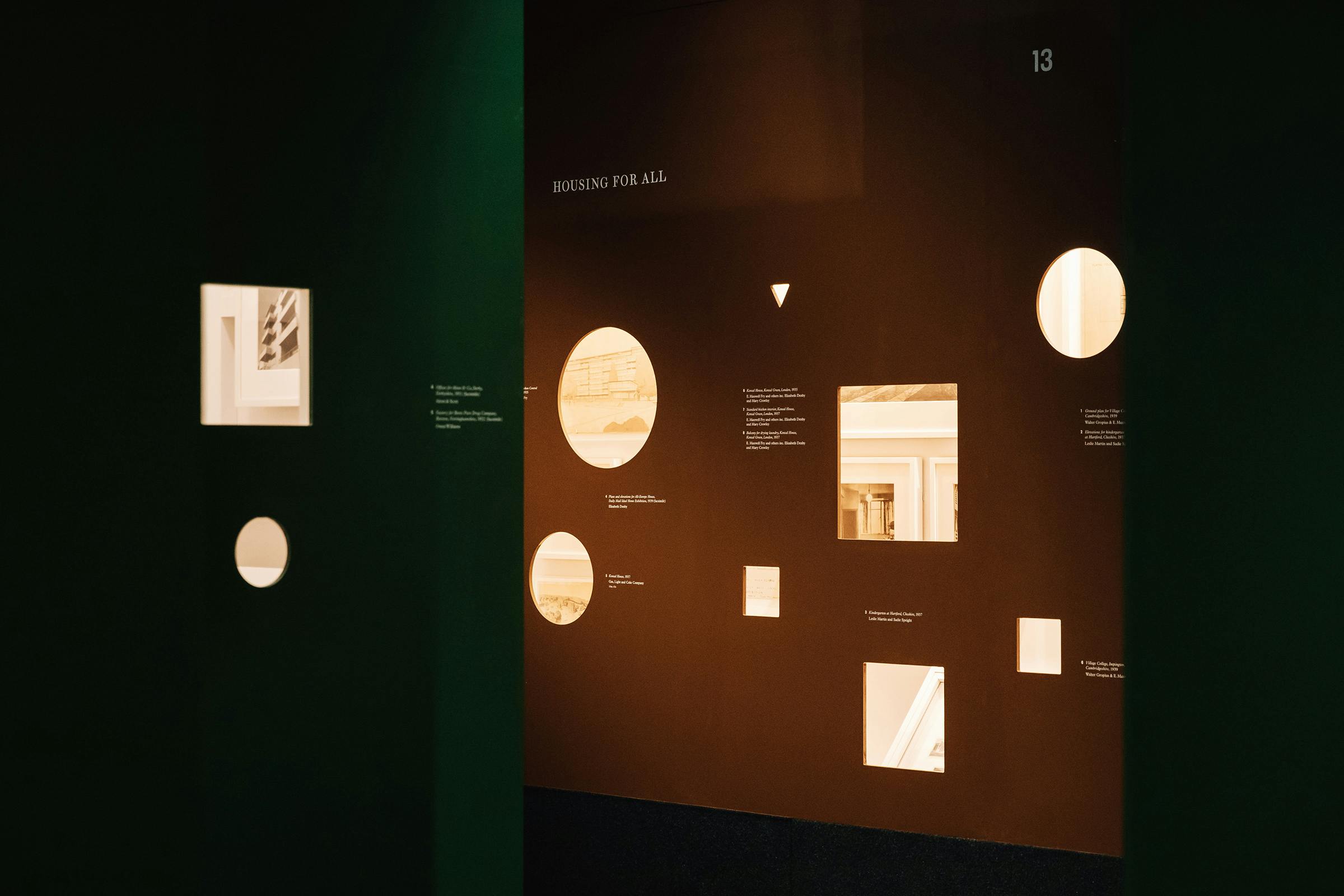
The story is explored through three chapters that are split between a forest of 16 coloured columns, which the visitors are led through by an extensive gallery guide.
Inspired by research into architecture periodicals of the time, we used a mixture of serif and sans serif typefaces to portray the creeping effect of modernism on more traditional British design. Titles and headlines are set in Brunel, a revival of a British ‘modern’ Didot style serif. Captions are in Plantin, a typeface often used in British print of the time that is based on historical models, but updated for modern printing techniques. And numerals are in Neue Plak, Paul Renner’s first attempt at geometric forms before he created Futura, the ubiquitous geometric typeface.
Client
Royal Institute of British Architects
Category
Exhibition
1 October 2019 – 1 February 2020
Architecture
Curators
Valeria Carullo and Pete Collard
Photography
India Hobson and Edmund Sumner
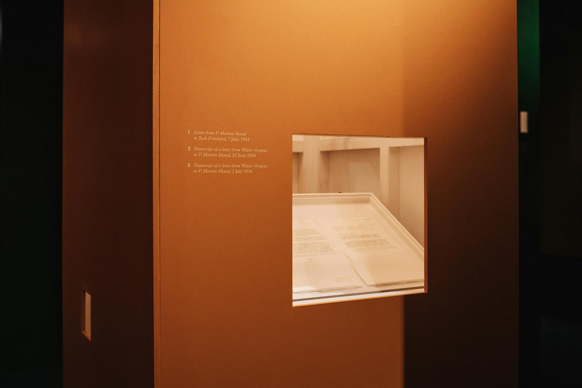
The gallery-guide draws attention to details in text and image by using several paper changes, a variety of page sizes and curated die-cut viewpoints that echo the exhibition columns. All bound together with black binding wire, a method commonly used on periodicals and journals of the time.
Colours are of a secondary palette throughout, referencing interior decoration in Britain – taking tentative strides towards the bolder tones used by the famous art school.
Format
210 × 297 mm
Extent
30pp
Binding
Comb-bound with Black Wire
Typefaces
Brunel, Plantin, Neue Plak
Selected as a prize nominee work for small graphics at the Tokyo TDC Annual Awards 2021.
The marketing campaign reimagines the design through the RIBA house style. Utilising the viewfinder shapes found upon the columns as bold highlights and graphic holders for a range of historical images from the 33 years covered by the exhibition.