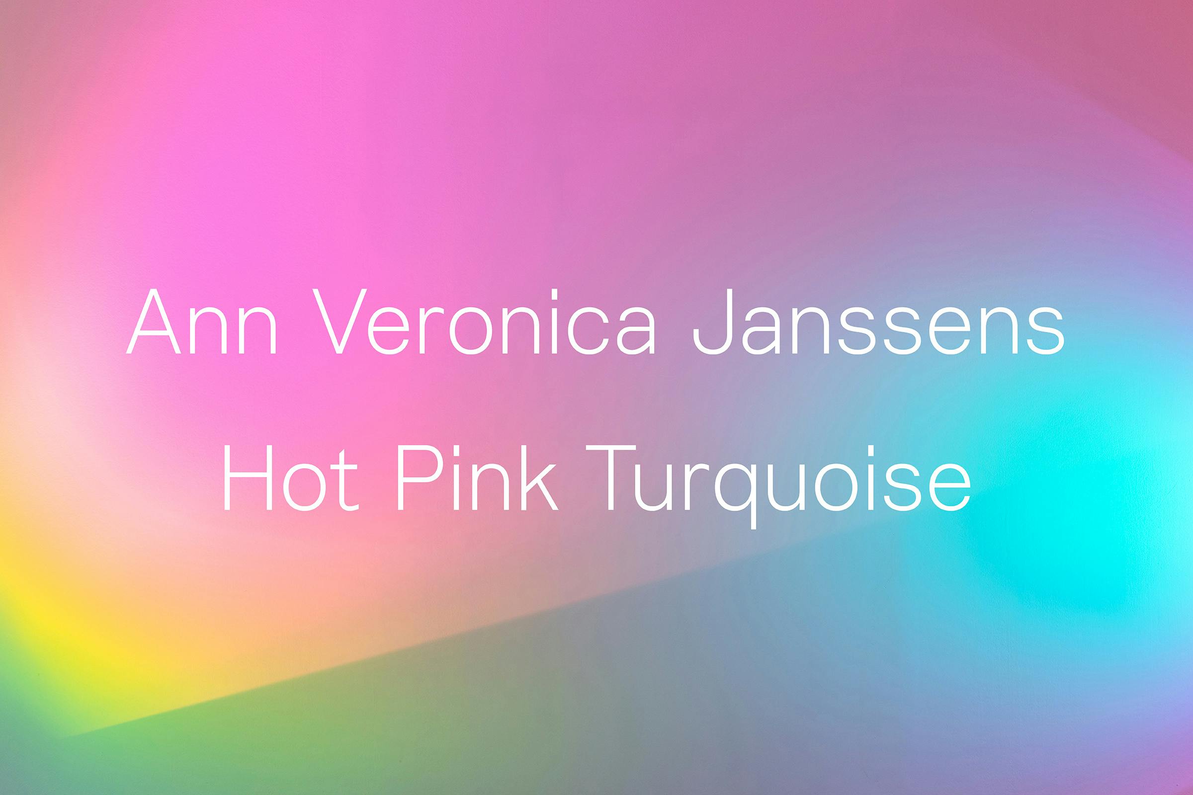
Ann Veronica Janssens: Hot Pink Turquoise
Belgian artist Ann Veronica Janssens has created an extensive body of work over four decades spanning installations, projections, immersive environments and sculptures. At the core of her practice is an interest in light and its impact on our perception and experience.
This exhibition at South London Gallery is the first major presentation of Janssens’ work in London, running across both sites of the gallery.
Client
South London Gallery
Category
Exhibition
23 September – 29 November 2020
Photography
Andy Stagg
Janssens’ work often take quite a simple appearance, hiding the complexities taken during the artworks construction, the explorations of material properties and the effects of light. Our approach to the design was to make the graphics a secondary aspect of the exhibition, allowing the works to take full prominence when you walk into a gallery space.
We used the lightest weight of WH Skeleton throughout the show, allowing colour and the environment to lead the identity. Skeleton is a typeface that is in development by the studio, created by mixing influences from both British and European type design – Janssens was born in Folkestone before moving to Belgium, something we wanted to give a subtle nod to in the identity.
The corridor wall of the main gallery entrance was painted a warm pink tone to lead you into the exhibition space. This mix of pink shades continues through to the gallery guide.
Captions were applied directly to the gallery walls at a large-scale, positioned away from the sculptures. A mid-grey tone helped them to sit back in comparison to the often brightly coloured work.
Gallery guides are hung throughout the corridor spaces on Perspex rods, a material reflective of those found with in Janssens’ work. The guide itself is surprisingly oversized, allowing text to be easily read as you explore the exhibition.
Format
125 × 353 mm
Extent
12pp
Binding
Saddle Stitched
Typeface
WH Skeleton
The marketing campaign continues this simple approach, laying text over details of the work, Hot Pink Turquoise (2006) to create compositions of graduating colour interacting with the lightweight typography.