Hogarth and Europe
A catalogue to accompany the Tate Britain exhibition, ‘Hogarth and Europe’, capturing William Hogarth and a collective of European artists as they explore the rapidly evolving eighteenth century – where luxury reached extreme new heights and poverty devastating lows. Hogarth and his contemporaries pioneered a new style of portraying everyday life, taking inspiration from its triumphs and flaws. Injecting energy, humour, satire and wit into paintings to effortlessly depict a sense of the new modern.
With Hogarth’s works ranging from realistic portraiture to comic strip-like series of satirical pictures, the essayist and poet Charles Lamb once said of him: ‘Other pictures we look at; his pictures we read’
The design translates this forward-looking eighteenth century aesthetic into a contemporary feeling publication. Using unexpectedly bright coloured tones throughout, taken from detailing found in Hogarth’s work.
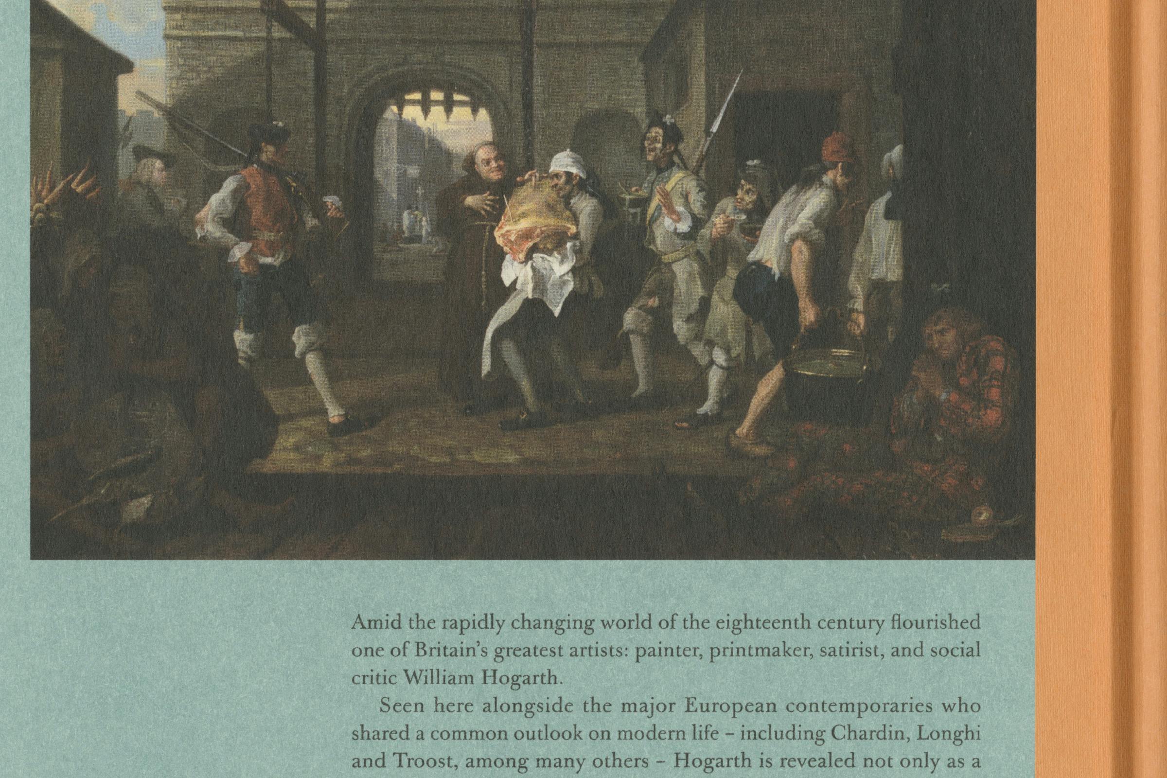
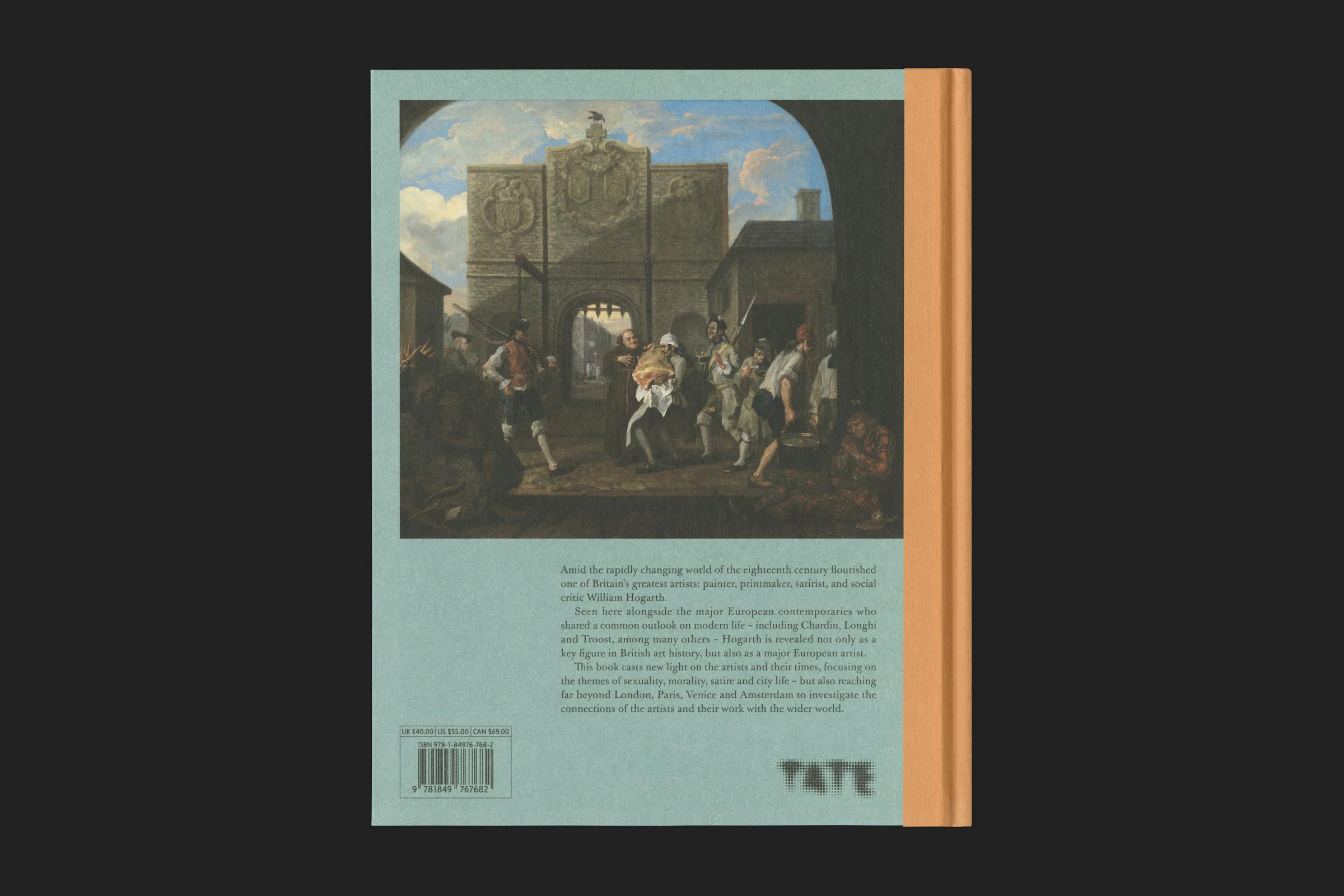
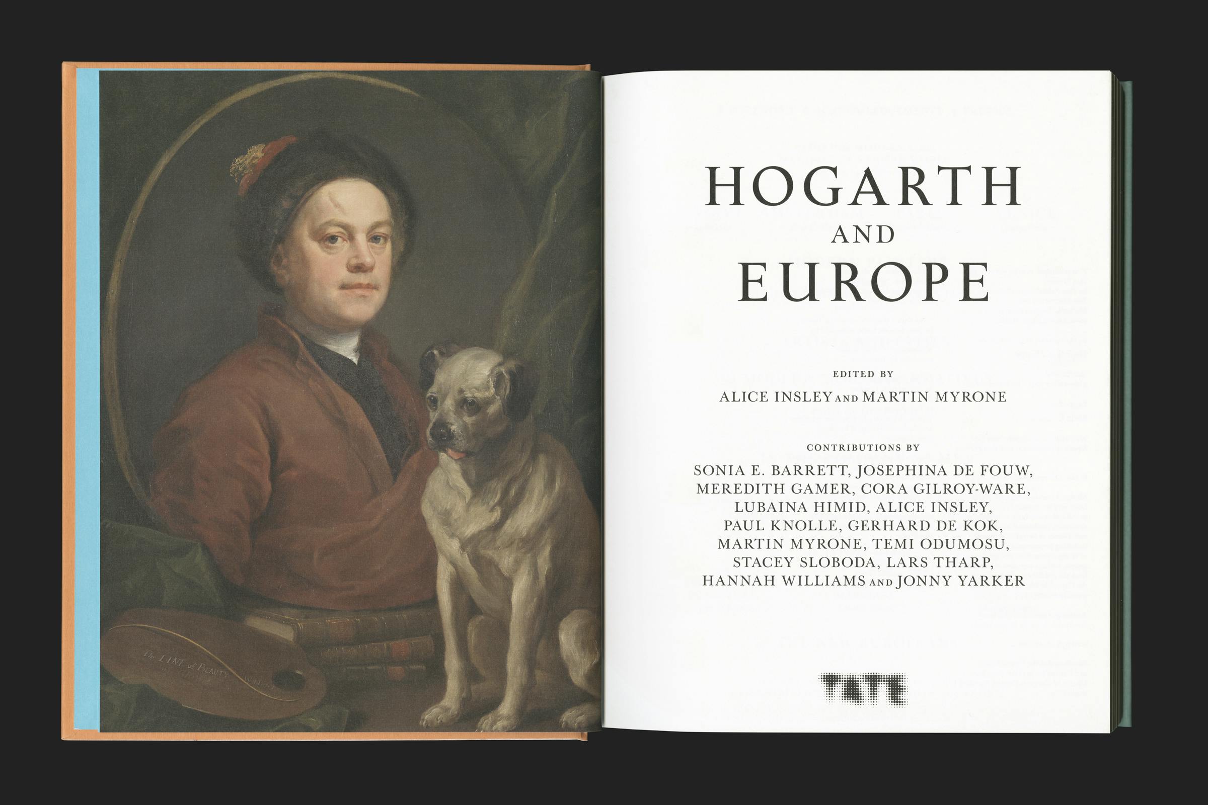
A three quarter bound cover of light orange with foiled black text, wraps over a printed strong and warm pastel green with depiction of O the Roast Beef of Old England (‘The Gate of Calais’) (1748). Endpapers are a bright sky blue – a strong colour that often softens the darker shadows in the paintings.
The catalogue is also a tale of four cities: London, Paris, Venice and Amsterdam, each represented in large engraved maps from the period. The themes of city life, social protest, sexuality and satire come to the fore in the art of Hogarth and his contemporaries work.
Hogarth utilised engravings of his paintings to reach a wider audience.* The typographic language and layout of the book takes inspiration from these, bringing in a sense of movement and decoration.
Format
210 × 265 mm
Extent
224pp
Cover
Three quarter bound
Binding
Section sewn
Finish
Foil
Typefaces
Castling, Baskerville Original
Images are considerately placed on the page rather than being locked to a rigid grid. Reacting in placement to elements such as the pointing of a hand or the gaze of an eye. Building a feeling of organic rhythm throughout the book. Occasionally intertwining with extended caption text.
Essay texts also play on classical formatting, giving wide margins to the outside of the page that allow the book to be comfortably held and read. Justified text creates a sense of order and formality.
Castling by Souvenir Type is used in uppercase for the cover and section titles, giving a confident flair. The remainder of the publication is set in Baskerville Original by Storm Type Foundry.
Baskerville† is one of the greatest pieces of British type design, but has been subject to many badly drawn digitisations. Originally release in the 1750s, this contemporary interpretation is not so much a perfect re-drawing of the original matrices, but rather a capturing of the warmth and elegance found on the printed page.
* This commercialisation of art helped to move away from the old model of patronage that previously restricted artists to creating work for the aristocracy. With the A Harlot’s Progress (1732) series, Hogarth created not only a new genre of art, but a new consumer base as well. Artworks were produced as a sequence of images that hooked the viewer into a running narrative. Utilising a subscription-style way of selling the work, with the paintings being the marketing imagery for the engravings.
† Baskerville is a serif typeface designed in the 1750s by John Baskerville (1706–1775) in Birmingham, England, and cut into metal by punchcutter John Handy. It was designed as a refinement of typefaces of the period, especially those of his most eminent contemporary, William Caslon. Created as part of an ambitious project to create books of the greatest possible quality (although the crispness of Baskerville's work seems to have unsettled or perhaps provoked jealousy in his contemporaries, and some claimed the stark contrasts in his printing damaged the eyes). Compared to earlier designs popular in Britain, Baskerville increased the contrast between thick and thin strokes, making the serifs sharper and more tapered, and shifted the axis of rounded letters to a more vertical position. The curved strokes are more circular in shape, and the characters became more regular. These changes created a greater consistency in size and form, influenced by the calligraphy Baskerville had learned and taught as a young man.