ublication Identity

ublication is a publisher of limited-run artbooks, created collaboratively with artists to give them space to further develop themes found in their practice. We work directly with the publisher and artists for each book, pulling on our production expertise to play with material, binding and print techniques.
The identity for ublication centres around a bespoke typeface that gives a recognisable voice to the platform, which includes a custom-built website and a range of printed media.
ublication Manifesto
ublication commissions and produces artworks conceived exclusively for the book format.
ublication is a collaborative undertaking: a series that grows through our encounters with individual artists and their projects.
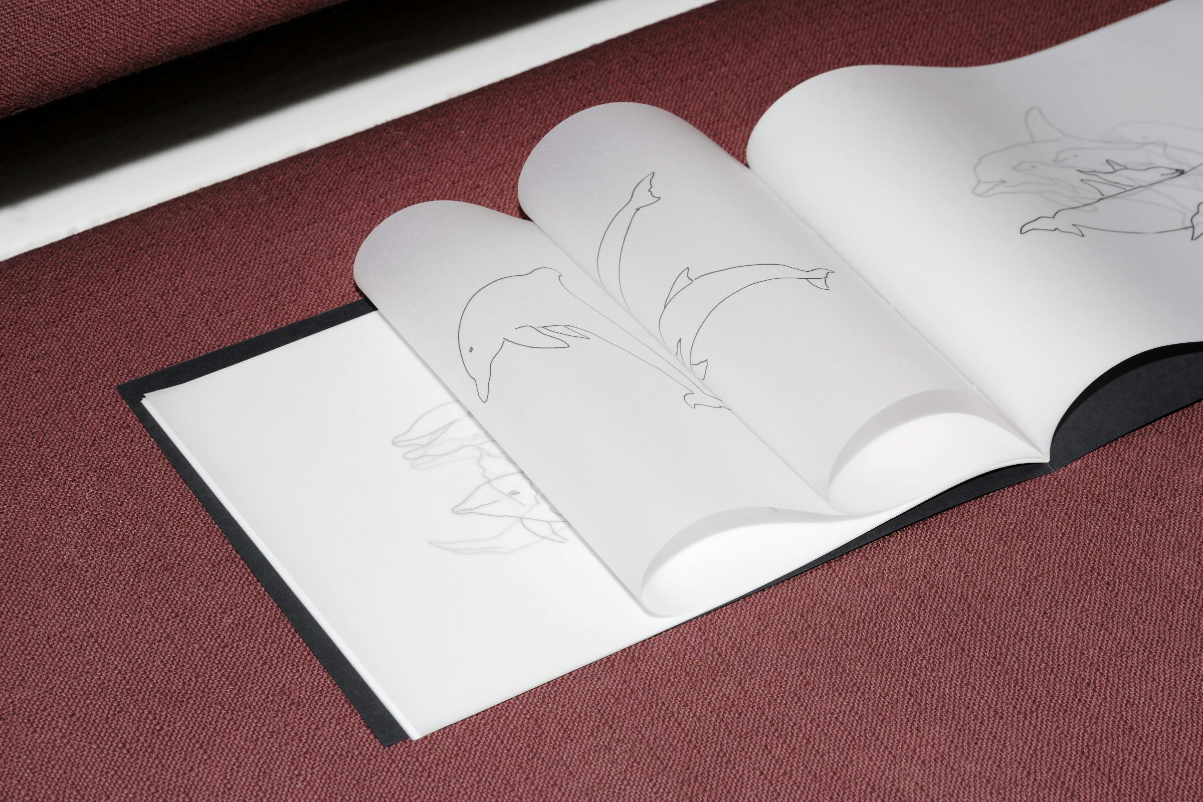
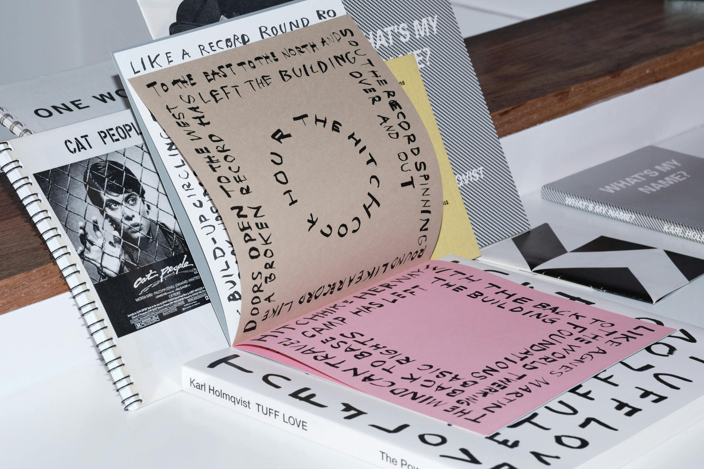
ublications have no fixed format.
ublications are slim.
ublications are printed in a signed and numbered edition of 65 copies.
ublication loves paper.
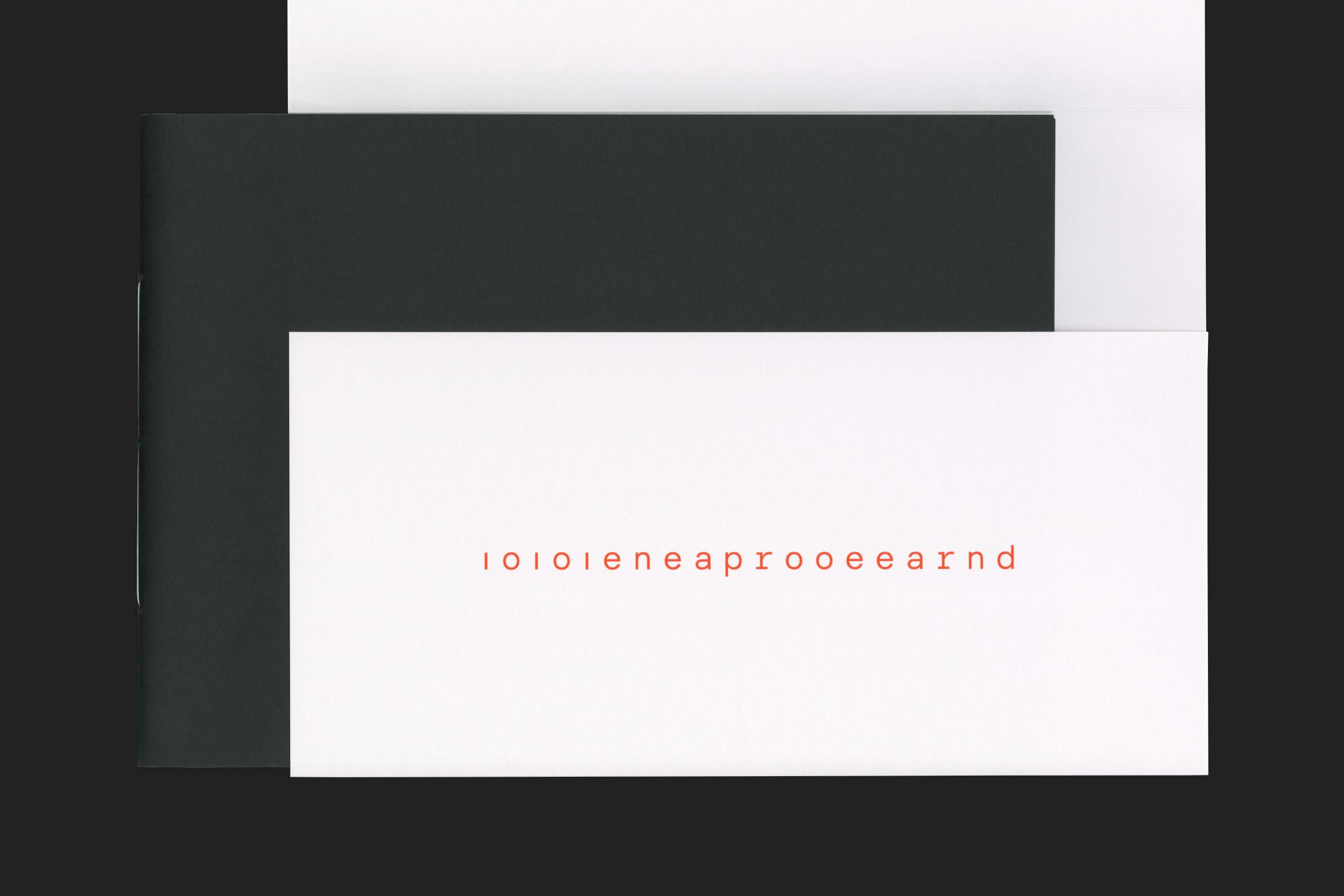
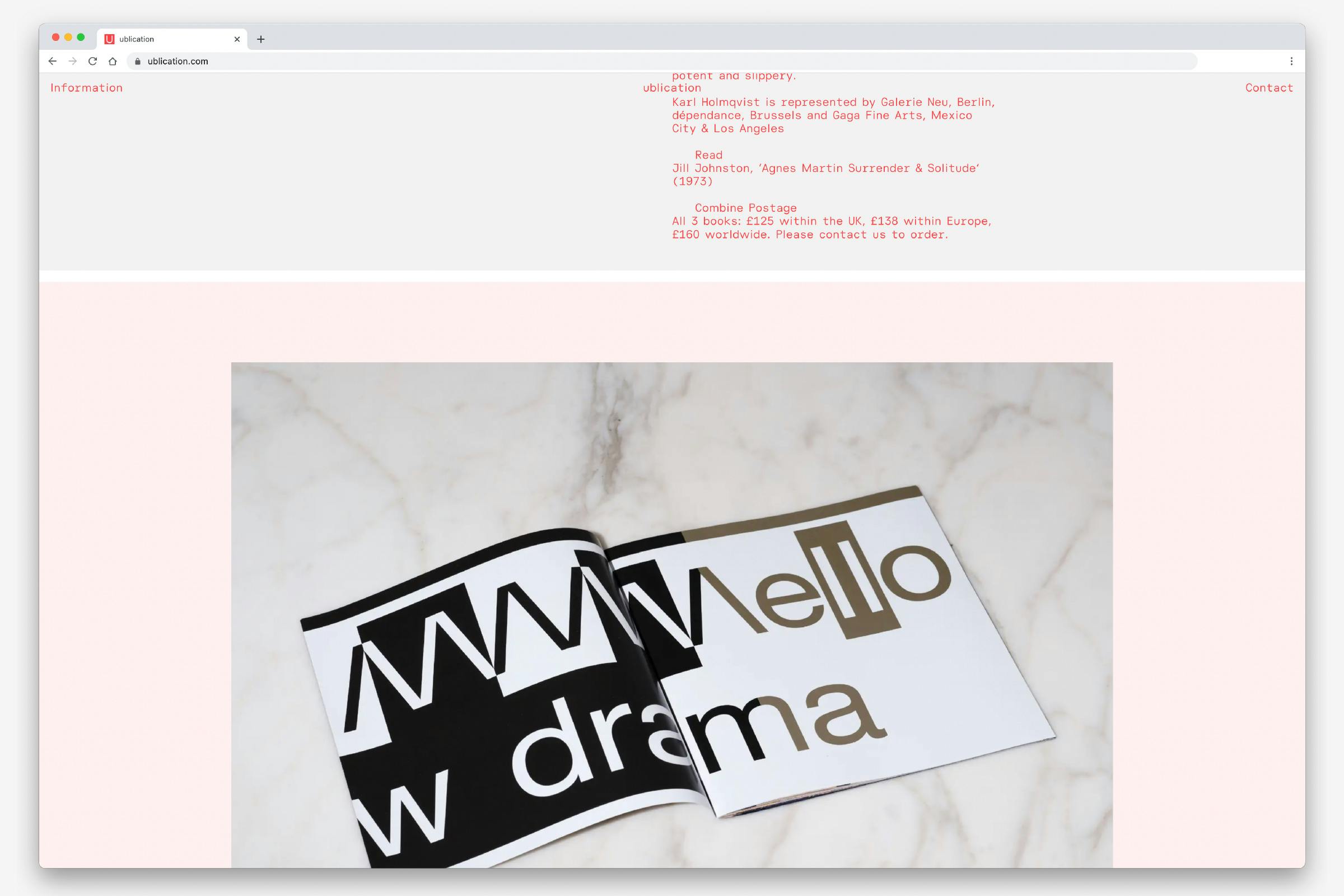
The ublication typeface takes reference from the data-driven language of the ‘archive’, which often utilise monospace* typefaces to create a simple visual structure. Through creating a bespoke typeface for the identity, we have developed a tool that enables all written output to be unified.
The lettering for ublication takes up three unit widths to give more of a sense of rhythm to text content. A half-space unit for slim letterforms like ‘i’, ‘j’ and small punctuation, and a 1.5 width unit for wider letterforms like ‘M’ and ‘w’. This width change creates a fluctuating alignment.
There are several alternate ‘display’ letters that can be used at larger sizes to give a further feeling of spaciousness. Pulling the angled legs of the ‘K’ and ‘k’ away from the main body, and losing the dots above the ‘i’ and ‘j’.
The sans serif styling nods to historical geometric office typefaces such as Neuzeit. Avoiding any feeling of neutrality through the use of angled line-endings, tapering curves and open-feeling lowercase letterforms.
Type Programming
Souvenir Typefaces
Selected as ‘in book’ for type design at the Tokyo TDC Annual Awards 2023.
Website
Development
Matthew Luke Studio
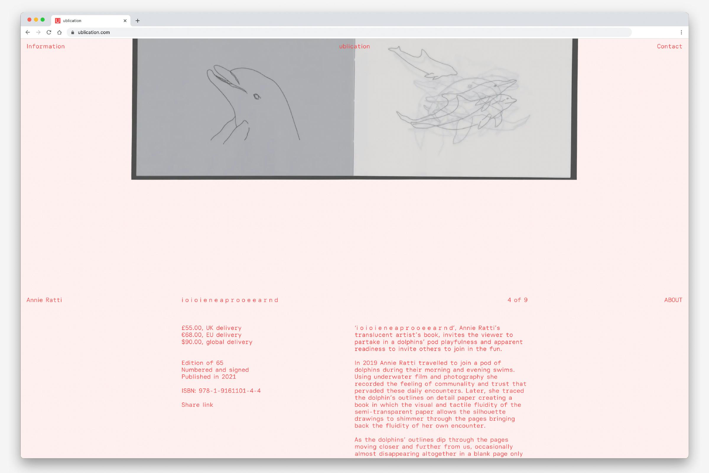
The ublication website is a single-page site that allows a user to browse through and purchase all available artworks within a single overview, quickly searched through bookmarked links at the top of the page.
Each book entry has a carousel of imagery, alternating from photography to flatbed scans, with a button to reveal a text description about the project and the artist. Further information about the publisher can be expanded out from the link in the top left-hand corner of the website.
The website is set to be an infinite scroll, always looping back to the artist list and perpetually presenting the list of works.
A container, often a folder or box, is produced to safely house each ublication, containing the colophon information and edition numbering.
By removing this information from the book itself we create a recognisable package for the brand, whilst leaving the artwork to be as simple as possible.
* A monospaced typeface – also called a fixed-pitch, fixed-width, or non-proportional font – is a typeface whose letters and characters each occupy the same amount of horizontal space. They were widely used for typewriters and early computers which often had extremely limited graphical capabilities, and have been utilised by artists to give structure within concrete poetry.