Making It: Women and Abstract Sculpture
Making It: Women and Abstract Sculpture is a group exhibition dedicated to a generation of pioneering women sculptors who came to prominence in the late 1960s and early 1970s. Taking an unexpected approach to their chosen media. Fusing gold leaf with linen, folding metal or hand-knotting rope, these artists challenged modernist conventions and expanded conceptions of the appropriate media and methods for sculpture.
Showcasing work by Olga de Amaral, Lynda Benglis, Françoise Grossen, Maren Hassinger, Barbara Levittoux-Świderska, Louise Nevelson, Beverly Pepper, Mildred Thompson and Sophia Vari. While not overtly feminist in concept, their work does not represent a retreat from politics. Rather, contending with the long-held belief – retained well into the 1970s – that sculpture was a muscular medium best suited to men, these artists stood against the prejudices and difficulty women encountered when trying to access the male-dominated spaces of foundries and workshops.
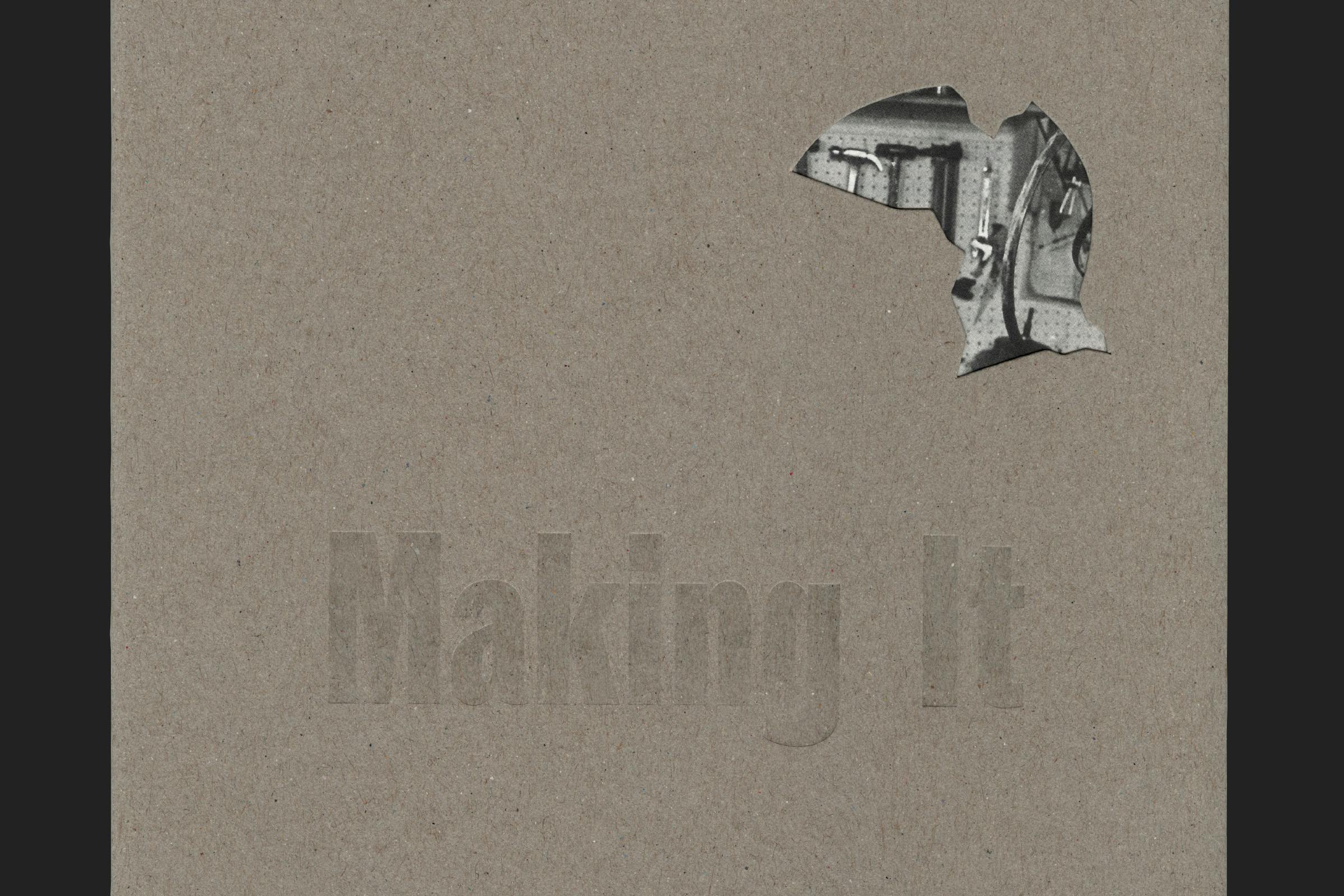
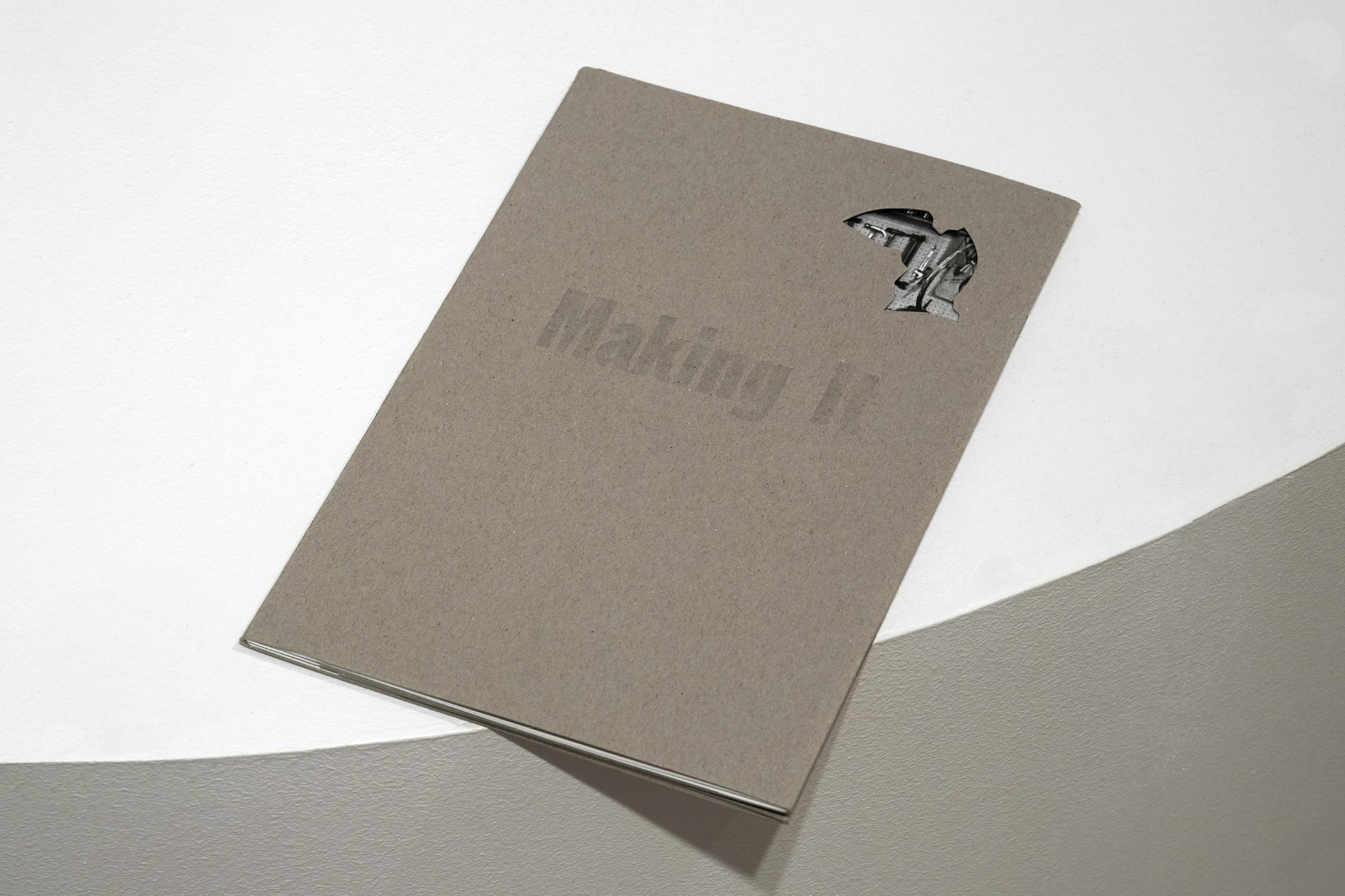
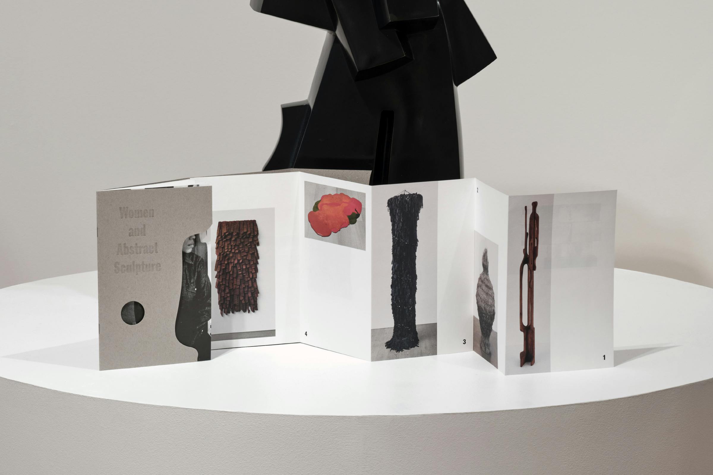
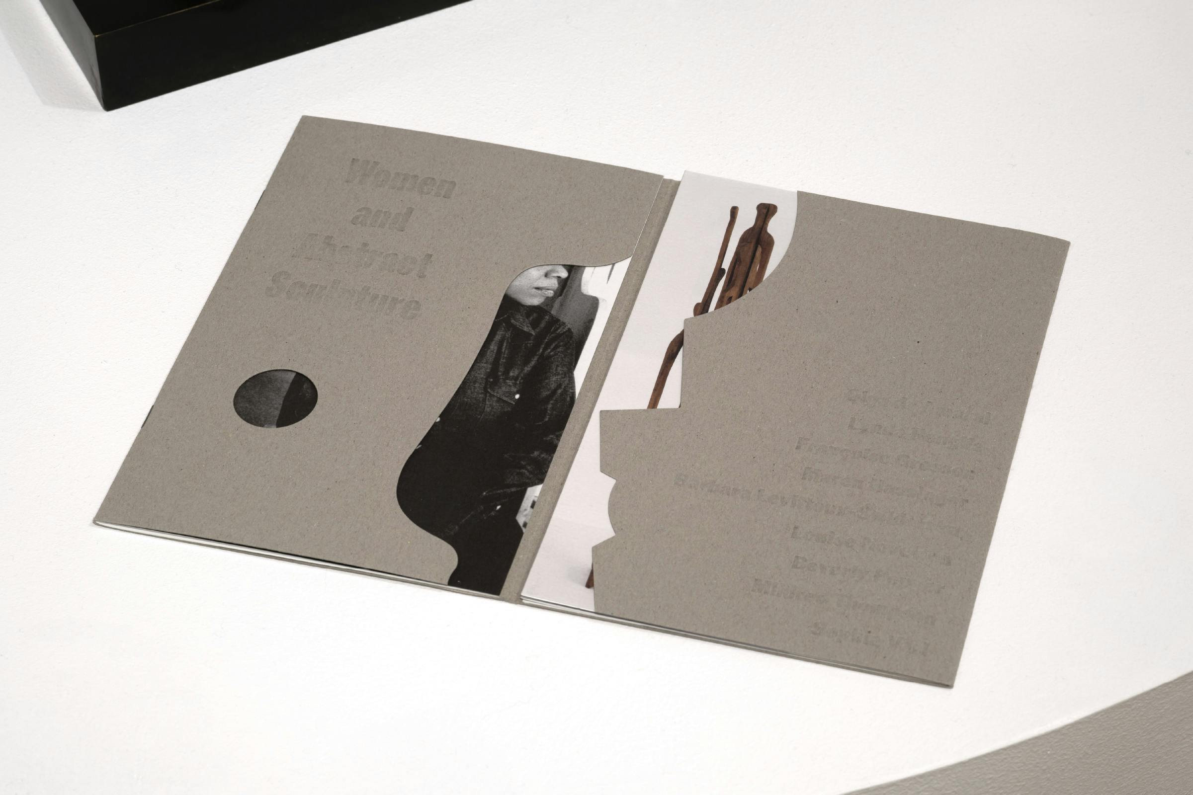
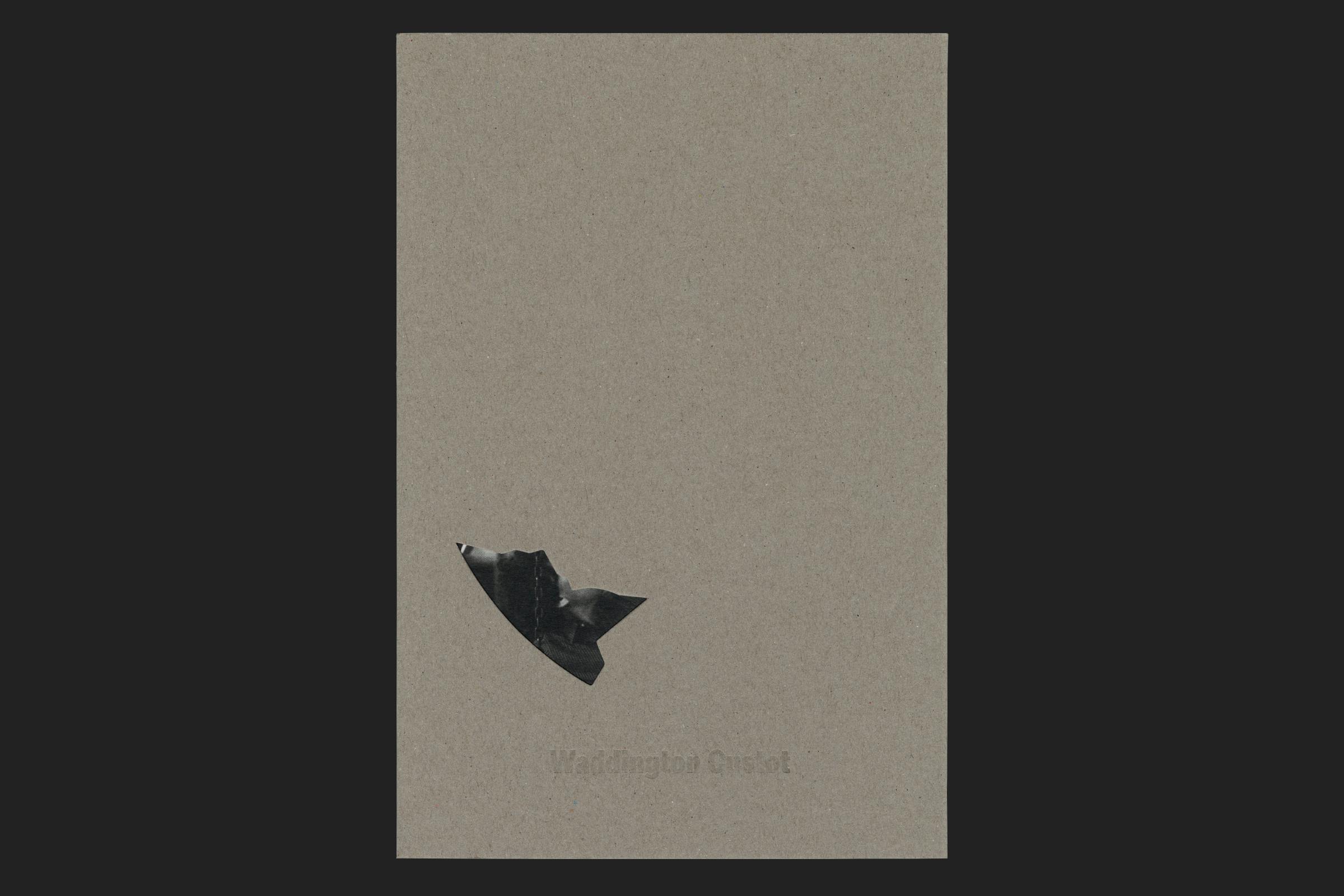
The act of physical intervention is very present in the accompanying exhibition print. The cover is created from a sheet of heavily textured recycled greyboard, die-cut with shapes taken from the negative spaces created within selected sculptures from the exhibition. These shapes become apertures to the scenes below.
Client
Waddington Custot
Category
Exhibition
1 October – 13 November 2021
Format
160 × 240 mm
Extent
16pp booklet + 12pp concertina
Binding
Saddle stitched
Typefaces
ABC ROM, Pirelli
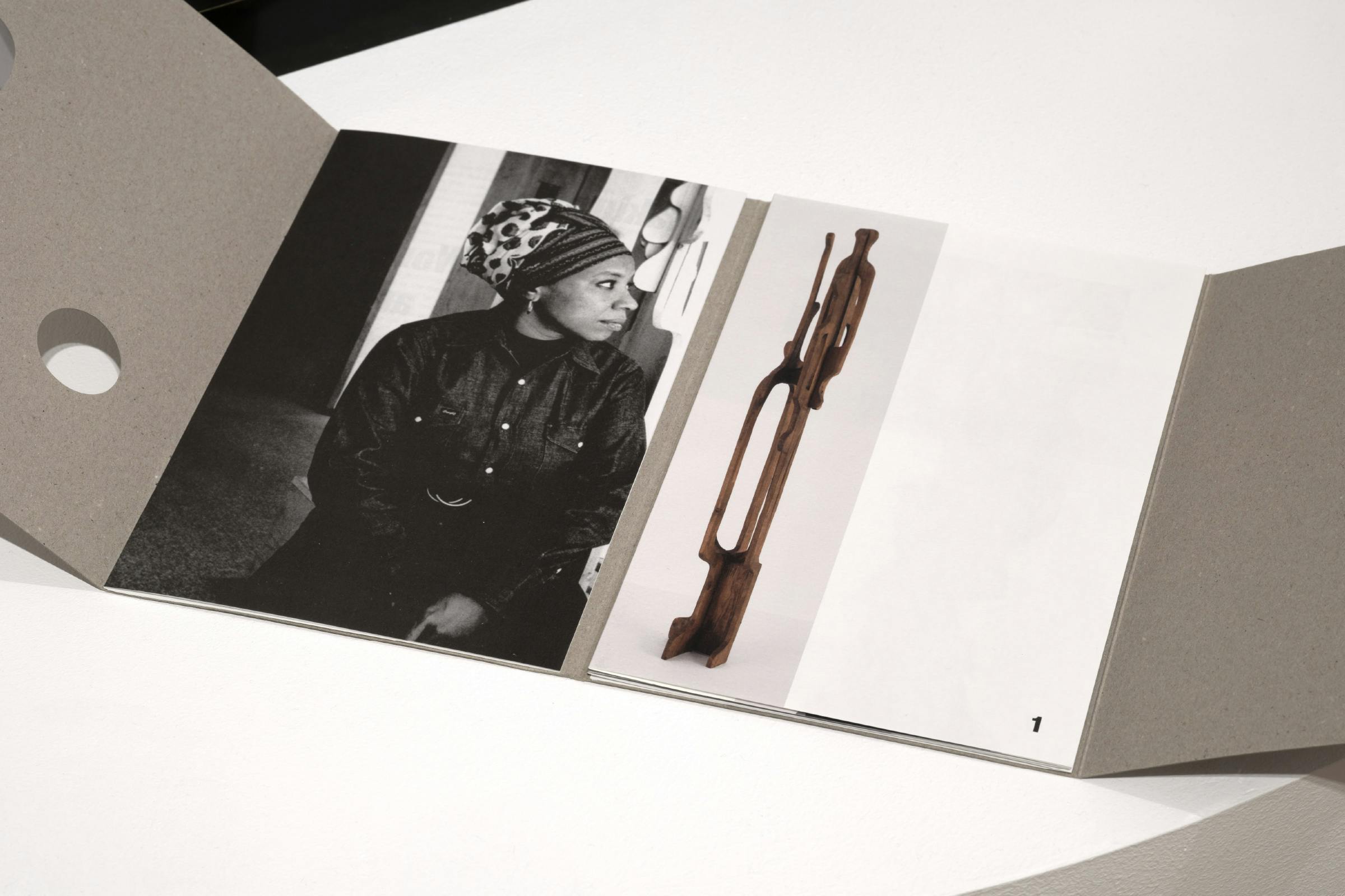
The print opens up to a concertina of work imagery on the right, and a booklet on the left. The booklet contains an essay, list of works, and extended biographies with portrait imagery. The concertina extends out to show a selected highlight from each artist.
Cover text is foiled using a transparent gloss, contrasting the rough finish of the recycled material.
Titles are set in heavy weights of ROM Compressed and Condensed by ABC Dinamo, giving a sculptural quality with a big physical presence. Body text is set in Pirelli by Jung-Lee Type Foundry, a typeface with a mono-line structure and an absence of flourishes that give it a concise expression with mechanical qualities. A high contrast between the width of uppercase and lowercase characters gives a sense of movement.
The exhibition design takes the idea of form further, with David Kohn Architects sculpting the gallery walls into curves and bends.
Captioning is printed onto an off-white textured adhesive-backed label paper, echoing the warm white uncoated material found within the booklet and creating a differentiation to the stark white wall colour. These are grouped together to give space around the works.
Architect
David Kohn Architects
Photography
Thomas Adank
A digital campaign for social media and email corresponds with the imagery found within the booklet, using coloured shades of grey and closely cropped greyscale details of the works to form the visual identity.