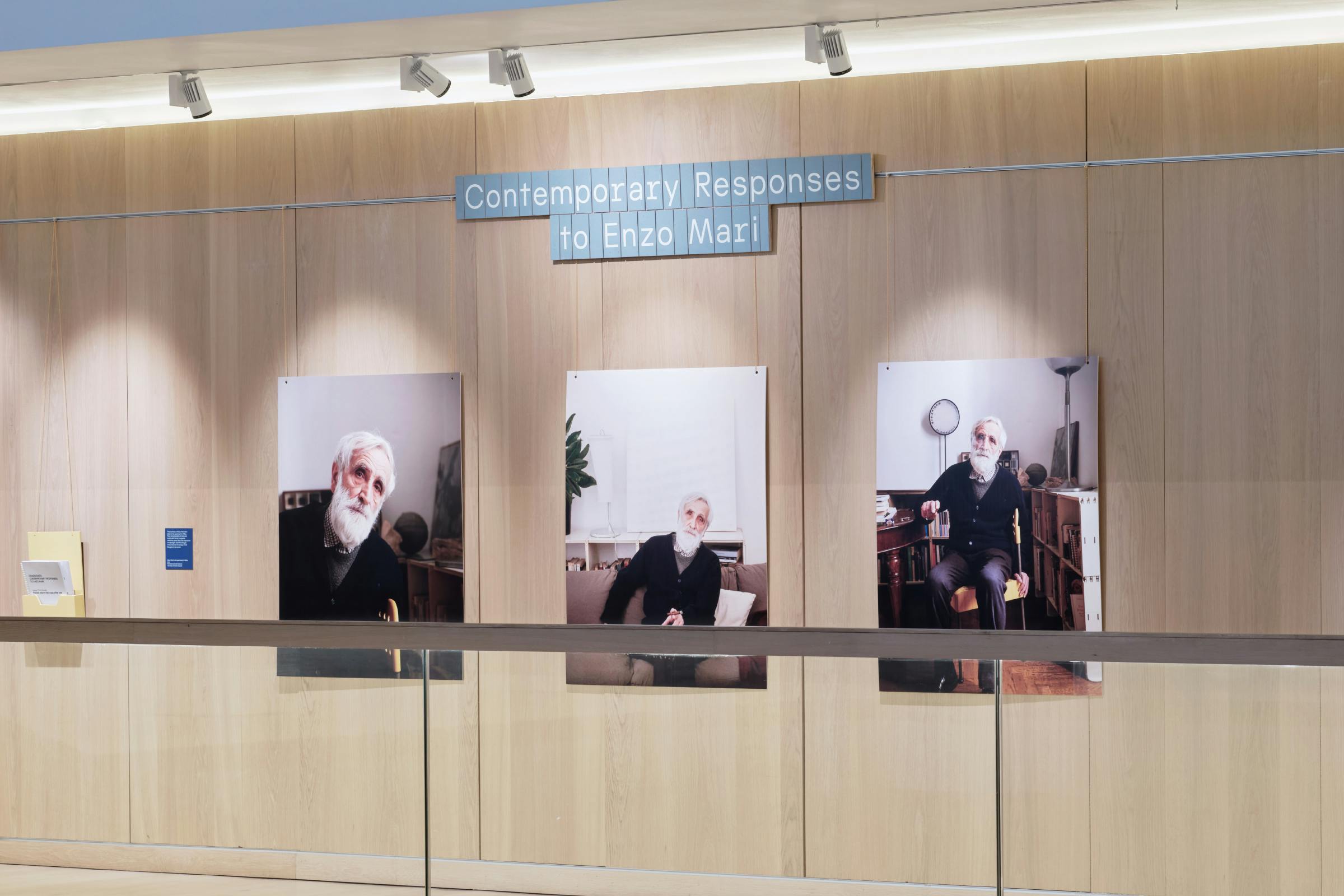
Grazie Enzo: Contemporary Responses to Enzo Mari
Sometimes a designer’s work is so influential that it inspires generations and continues to resonate beyond their lifetime. The Italian designer Enzo Mari was one of the most significant designers of the 20th century, his work spanning disciplines such as art, graphics, product design and education.
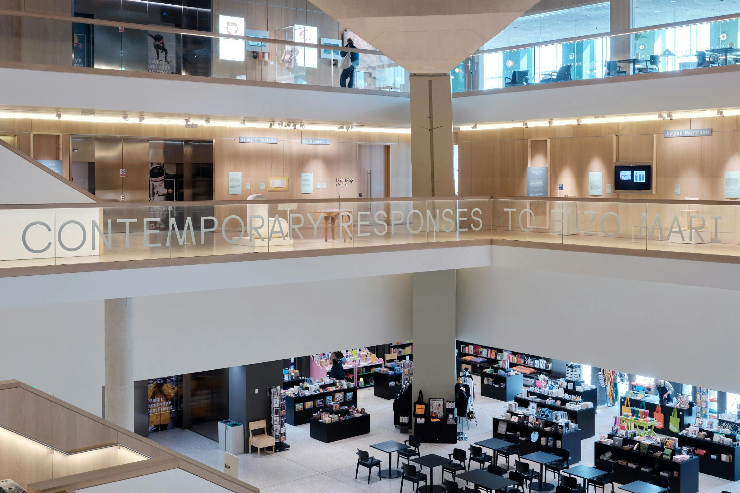
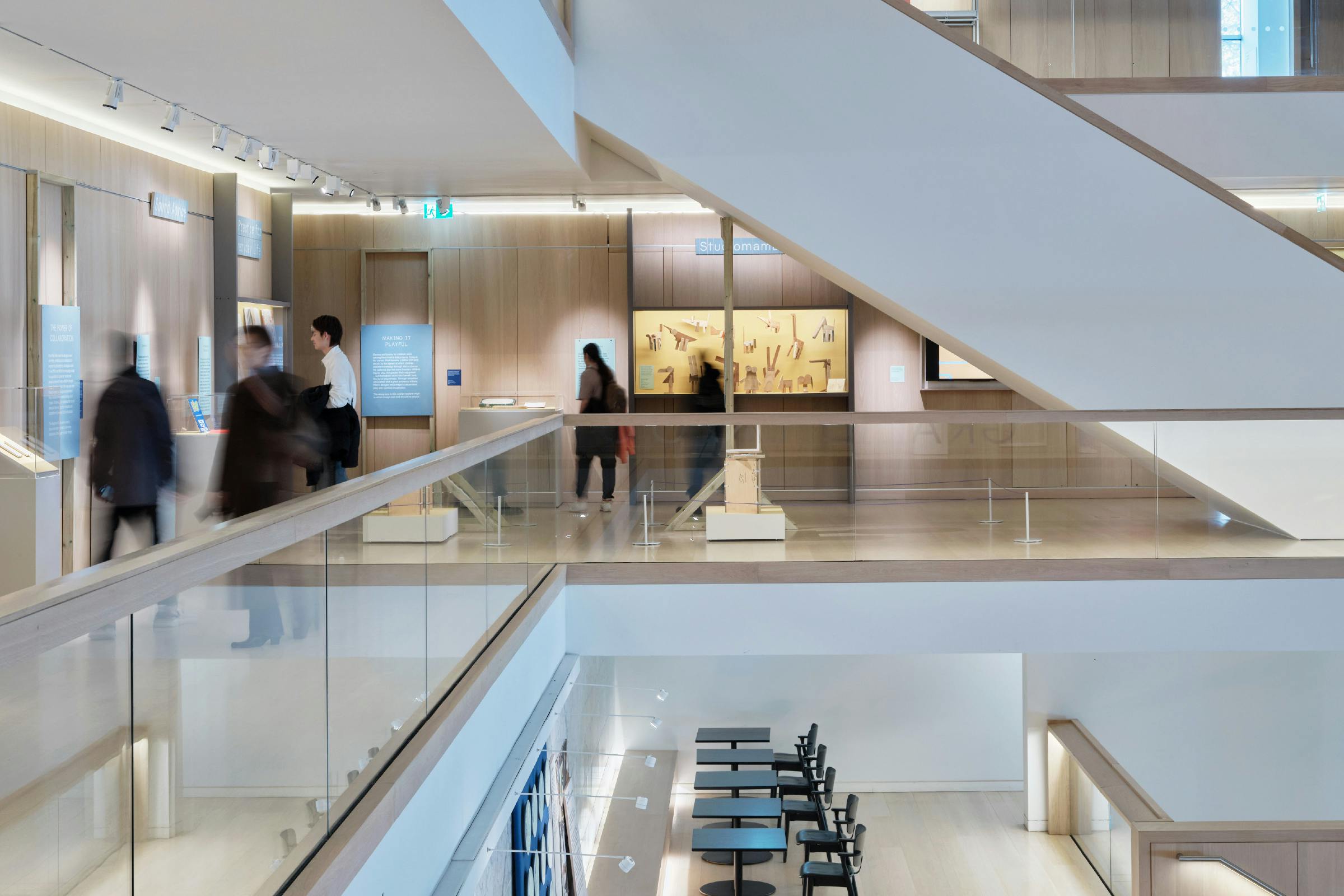
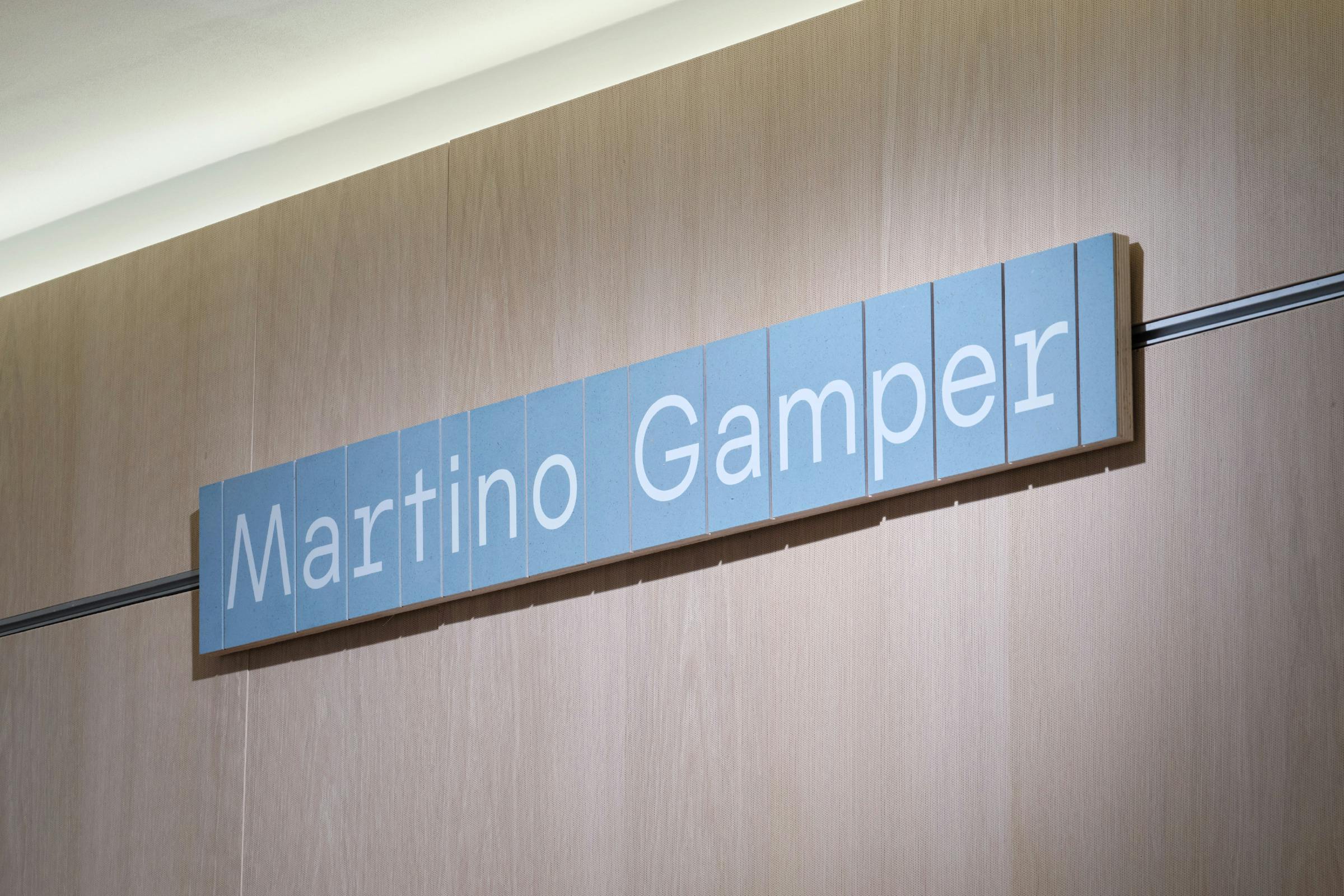
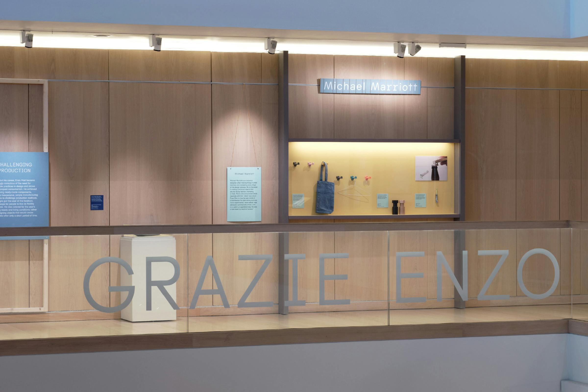
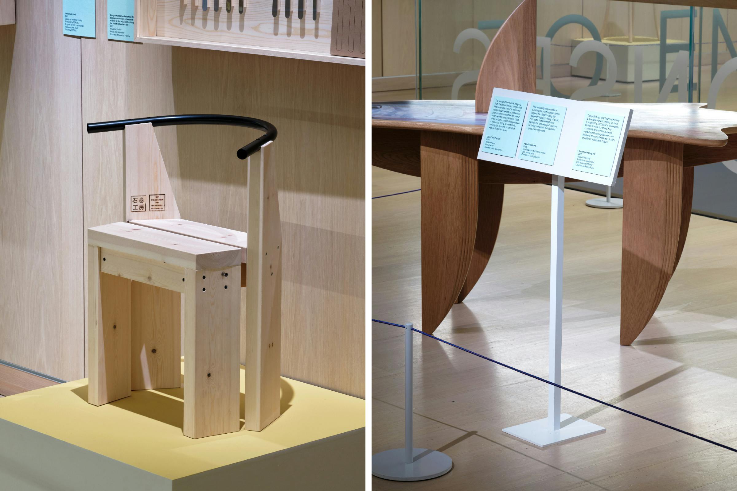
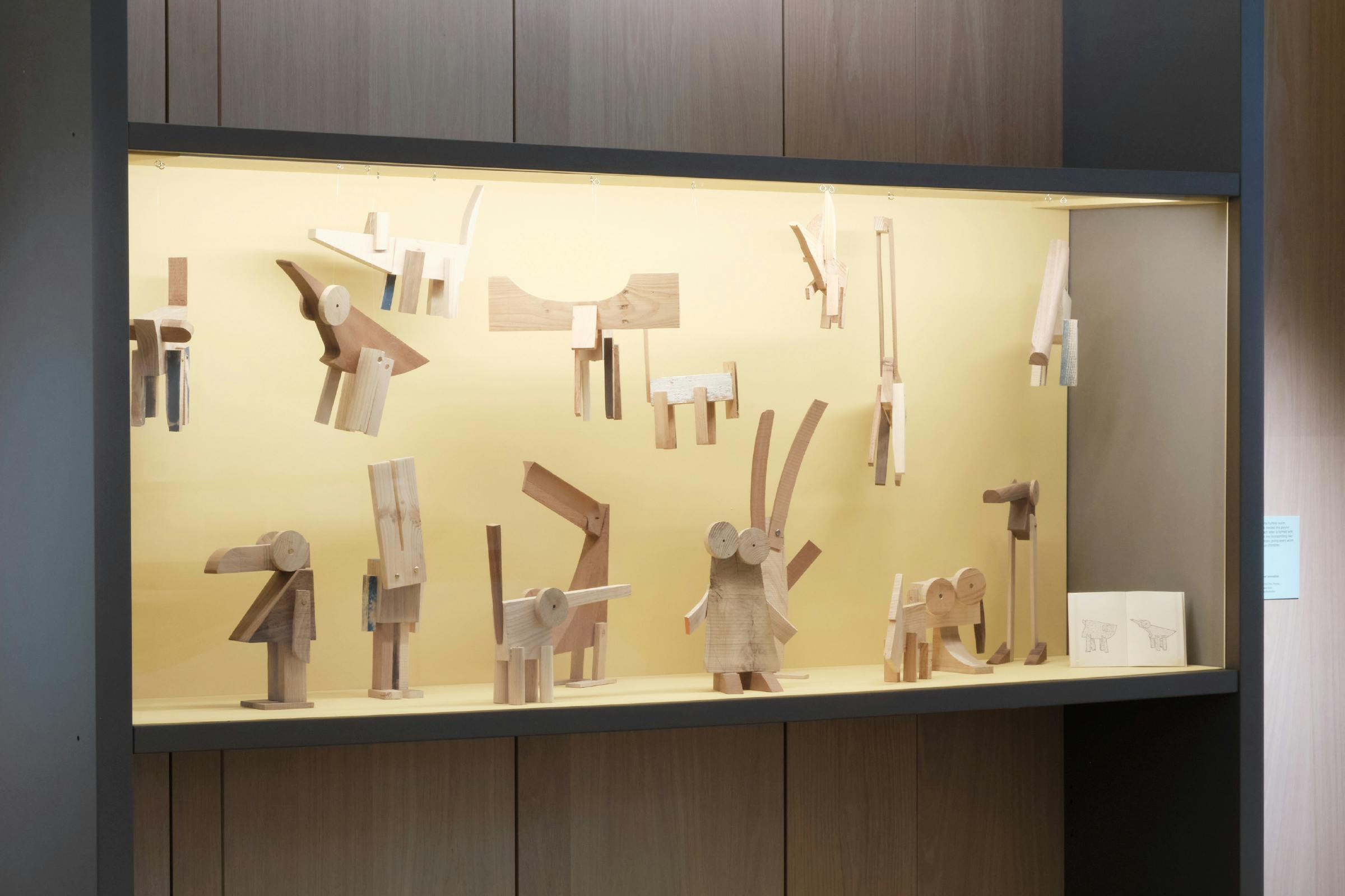
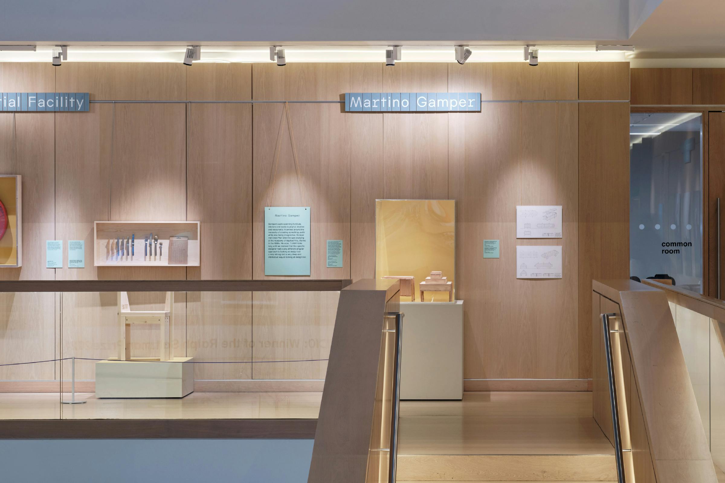
Mari’s wide-ranging practice has been a reference point for many and this display around the 1st floor of the Design Museum features a selection of London-based designers and studios whose work shares an affinity with Mari’s – whether through challenging production processes, his attention to the simplification of form, his engagement with toys and games, or his desire to democratise design.
Client
Design Museum
Category
Exhibition
29 March 2024 – February 2025
Curator
Esme Hawes
Typefaces
WH Universe, DM Schulbuch
Photography
Thomas Adank
The exhibition utilises a custom typeface for the titles, WH Universe, a system of four-width lettering that builds up a uniform structure in text. The letterforms reference characterful Italian sans serif explorations that strayed away from the clinical modernist approach of the 1960s, as well as the modular card structures found in Mari’s children’s games. Further emphasised through the application of cut, individual lettering for the designer titles.
This was also applied as super-sized lettering running on the glass balustrade around the entire atrium of the museum to draw visitor attention from the lobby below.
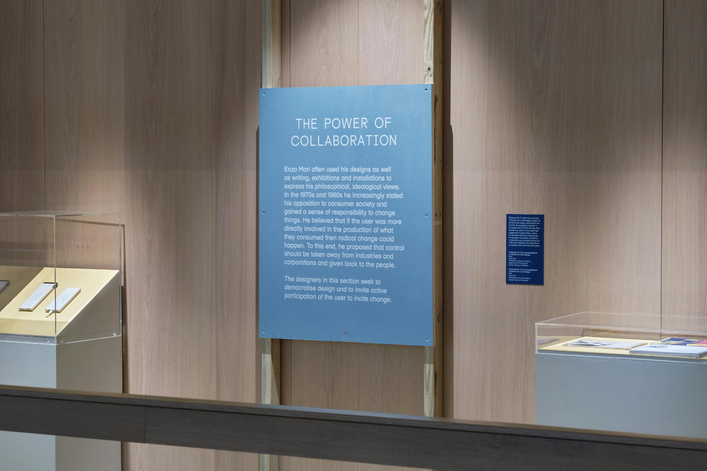
An important aspect to the exhibition design was that we utilised recycled and sustainably sourced materials as much as possible for the interpretation. Taking into account the footprint of where they are sourced, how recyclable they are once the display is finished, and the credentials of the production company used to manufacture them for the show.
The designer titles and section panels were printed on Foresso No-Chip, an innovative material created by recycling the extraction dust from the Foresso factory in Birmingham, bound with a non-toxic glue. Embracing the unique surface with the occasional larger wood chip or other coloured oddity.
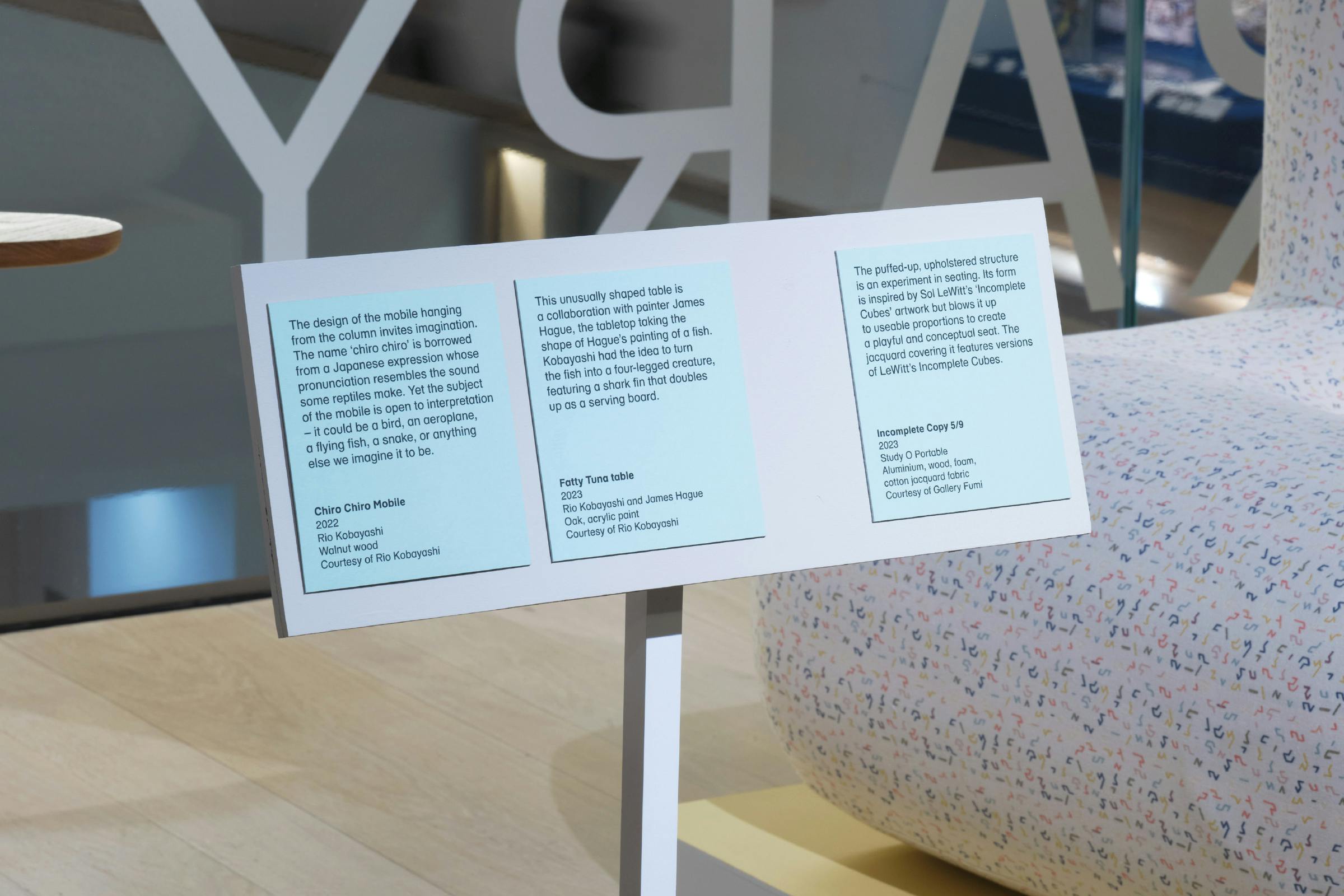
The captions and sub-section panels were printed onto a fluted packaging board with a different colour tone applied to each side – which we then flipped over to indicate whether an object was by Enzo Mari (dark blue), or one of the exhibited designers (green). This material is batch made in small quantities to order, has a strong durability, and can also be easily recycled once the exhibition is finished.
Sub-section panels were hung from the museum’s existing display rail using bakers twine, a thin, two toned, yellow and orange traditional cotton rope that compliments the interpretation colours.
The surfaces and inner panels of the display cases were also painted yellow to further emphasise this accent.