Antonio’s Dream: A Journey Through Art and Textile
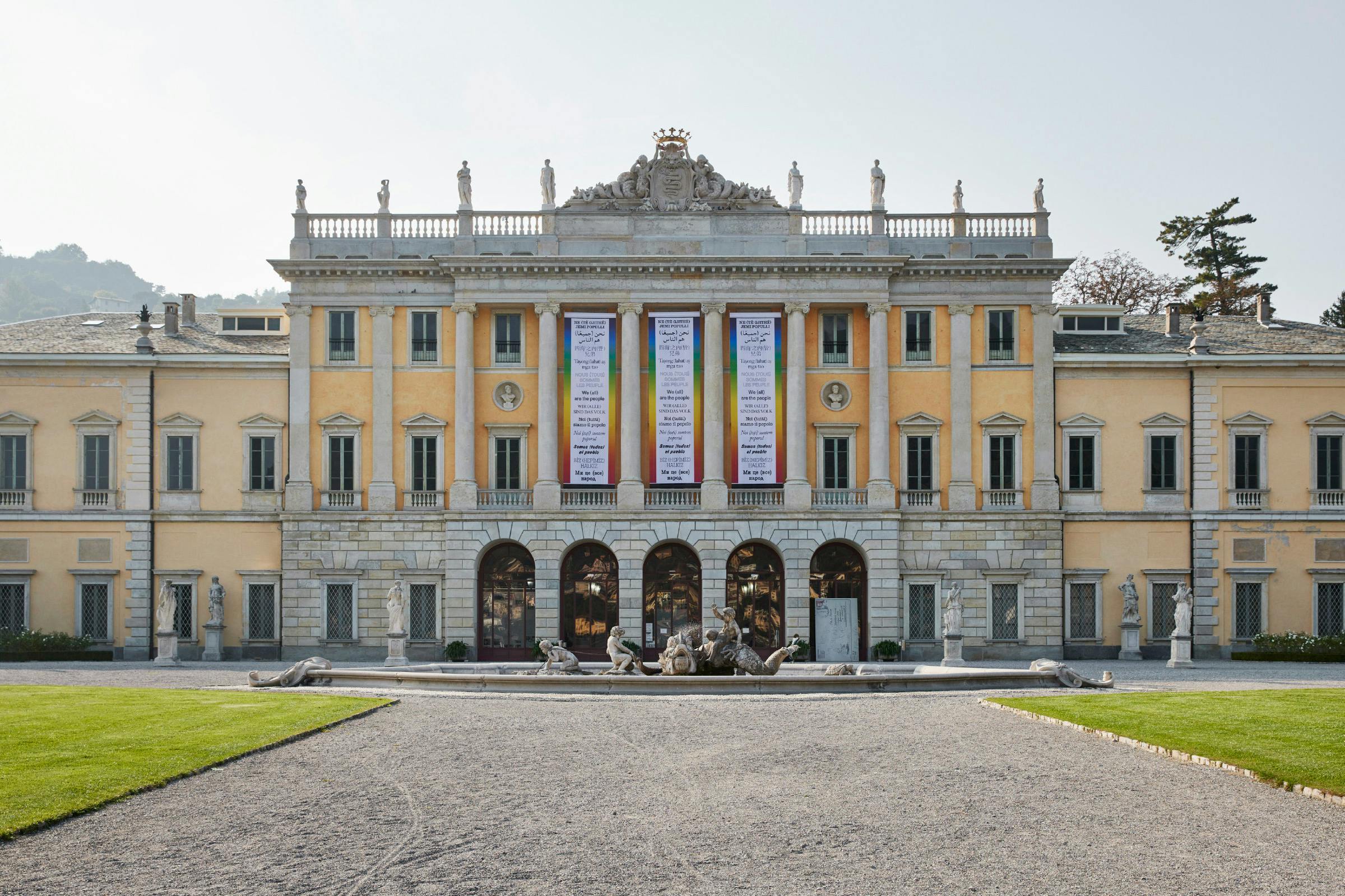
Antonio’s Dream: A Journey Through Art and Textile, or, Il sogno di Antonio: Un viaggio tra arte e tessuto, is a large scale exhibition exploring the life, work and collection of the Italian industrialist and textile entrepreneur Antonio Ratti. Intertwining ancient textile research, contemporary works of art and archival materials to create a journey between Villa Olmo, Villa Sucota and the kilometre of park land in-between, creating a focal point that overlooks Como, the city that is so integral to Antonio’s story.
Antonio was a big patron to the arts; commissioning work, creating a free further educational programme, and setting up the Foundation to house his collection and archive. This is a celebration of his vision, interwoven with site specific artwork from a large variety of artists that explore themes within his narrative.
Client
Fondazione Antonio Ratti
Category
Exhibition
10 October 2021 – 31 January 2022
Curators
Annie Ratti, Lorenzo Benedetti, Maddalena Terragni
3D Design
Philippe Rahm
Typefaces
Triptych, ABC Diatype
The exhibition begins in Villa Olmo with an 11 metre wide chronology of his life and the progress of RATTI, the company he created. This timeline takes the form of a centrally running line, with Italian above and an English translation below. Contextual imagery is interspersed along the edges.
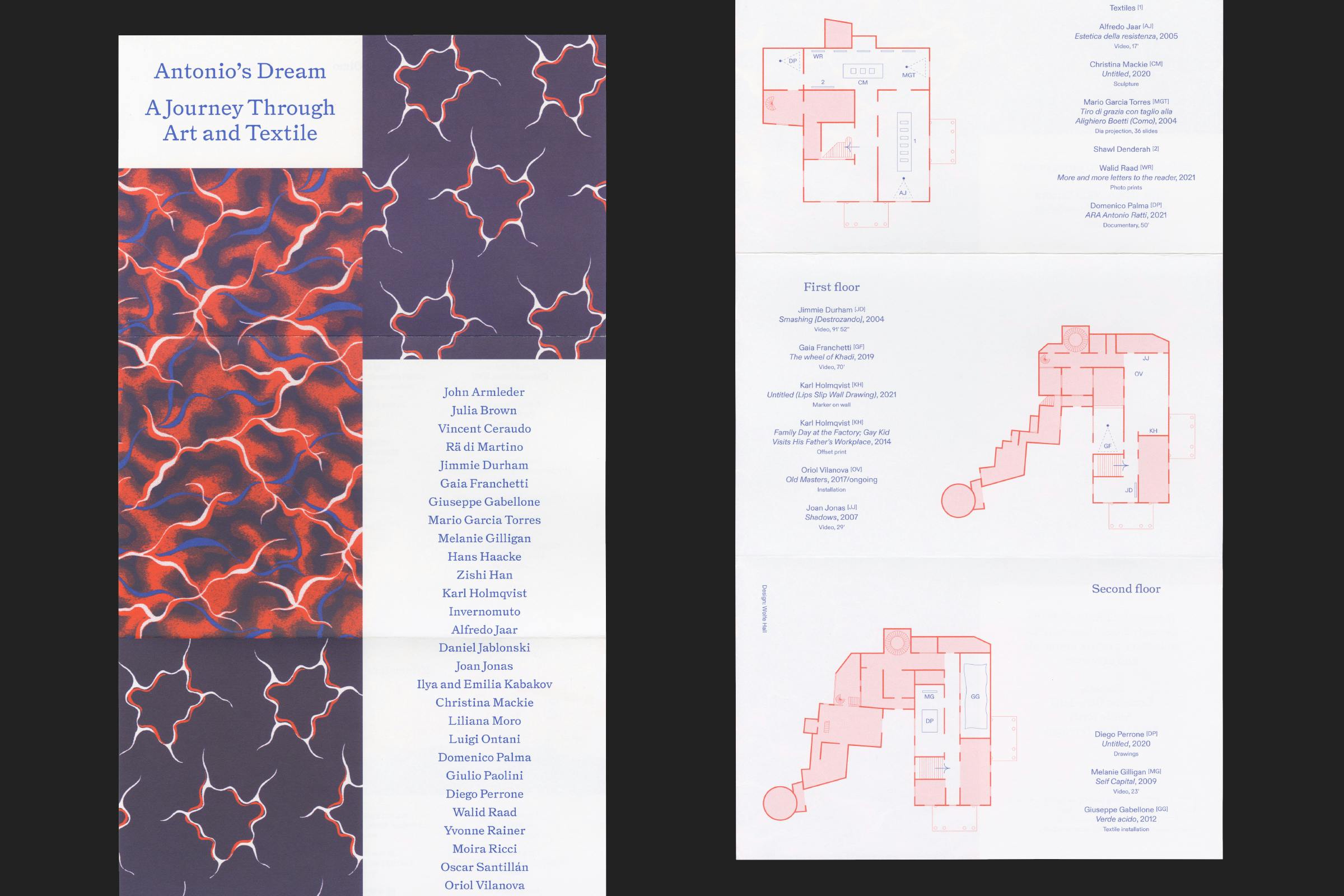
A printed fold out with corresponding image captions accompanies the chronology, printed in red and blue, which also aid in distinguishing between Italian and English text throughout the identity.
The textile collection forms the basis of the exhibition identity, using scans of archival RATTI repeating fabrics as a bold accompaniment to the decorative typography. The patterns have been converted to be a duotone and printed in two bright Pantone colours.
A concertina gallery guide helps visitors to navigate across the two large villas and the garden between. Splitting between simple floor plans and maps on one side, and forming a collectable poster for the exhibition on the reverse. There are two alternating coloured versions for the two languages.
Titles are set in Triptych by The Pyte Foundry, an interpretation of Antique No. 7 by Miller & Richard (1858). A typeface that was in wide global circulation, and that we found annotating details on many of the (also) antique fabric samples that Antonio collected and was inspired by throughout his life. As a style of lettering, it would have once been seen as functional and sparse, but in modern eyes it has become quite flamboyant.
Body text is set in ABC Diatype, a warm, functional, contemporary typeface by ABC Dinamo. In contrast to the decoration of Triptych, this pared back sans serif bring order to the sometimes busy artwork.
An extended publication guide is also available, detailing artworks and providing a more in-depth look at Antonio’s story. Using playful arrangements of imagery and changing column text colour to give variation to the layout.
Posters and flyers utilise the repeating patterns between the Italian and English designs, enabling them to tile up when positioned together to create expanses of textile.
Banners were displayed across the city to promote the exhibition. Forming bright backdrops on railings and across bridges, bringing in expanses of blue to contrast the greenery of the city’s gardens.
Short animations for the Foundation website and social media accounts build on this and bring in further textile designs, layering them up in short bursts to give the impression of shifting through an archive.