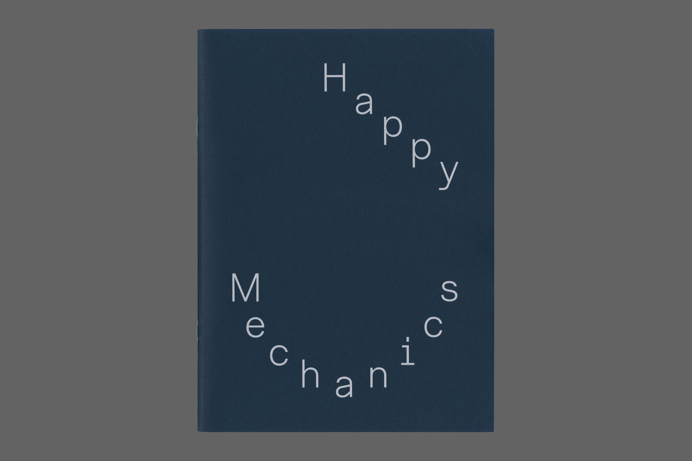
Happy Mechanics
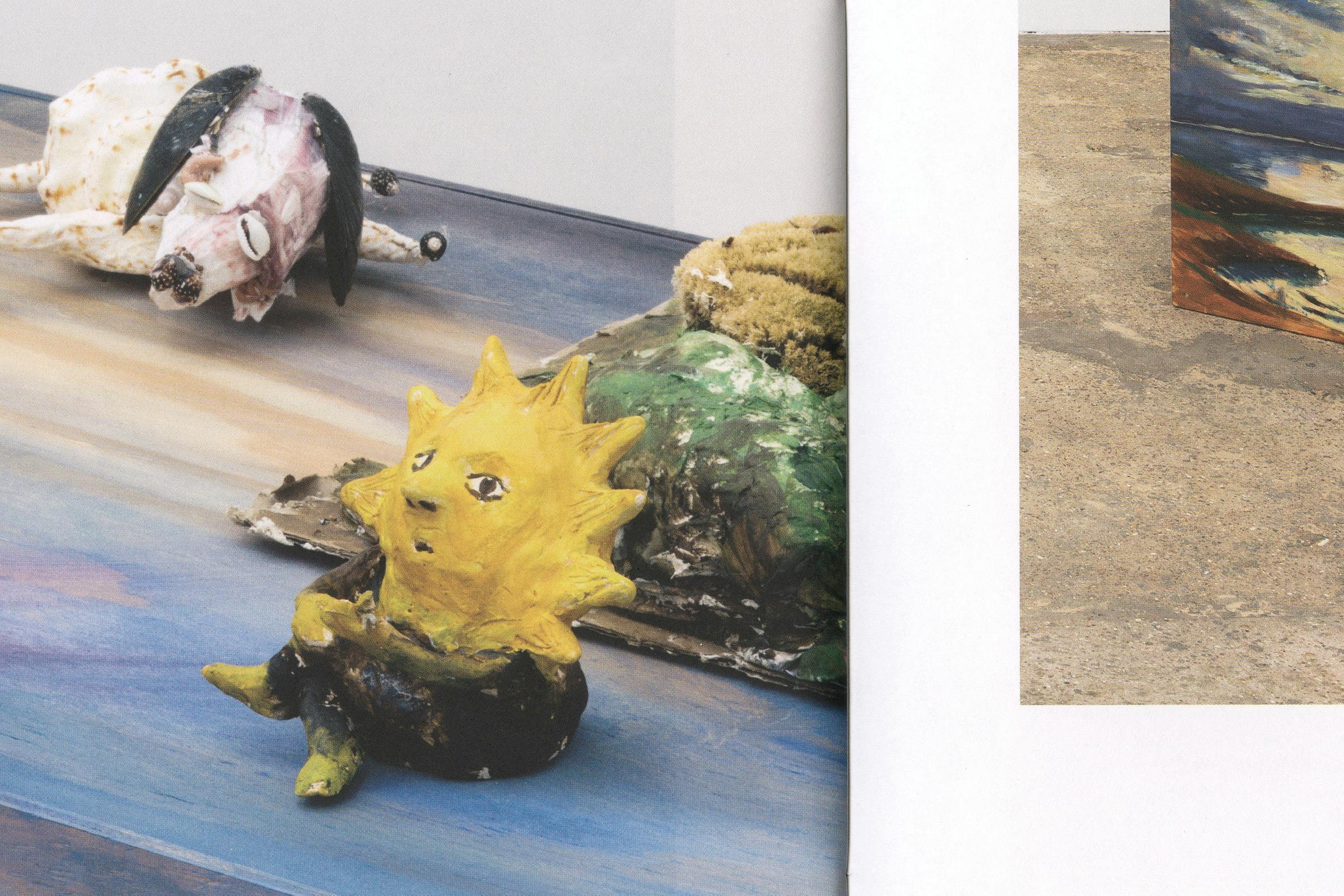
Happy Mechanics is a group exhibition of work inspired by and often created from everyday objects. From household items through to the industrial, exploring their physical attributes and materiality whilst retaining their recognisable integrity.
Featuring: Knut Henrik Henriksen, Lubaina Himid, Thomas Lanigan-Schmidt, Ellen Lesperance, Nancy Lupo, Manfred Pernice, Stuart Sherman, Hayley Tompkins, Amelie von Wulffen and B. Wurtz.
The publication references product guide booklets that are often quickly discarded. Using a stark white uncoated paper paired with a heavy cover, saddle-stitched together.
The cover design positions the title lettering in a playful arrangement, bringing attention to the mechanical qualities of each letter. Printed in Pantone silver over a dark blue board, giving an unexpected metallic machine-like shine when caught in the light.
Client
Hollybush Gardens
Category
Exhibition
18 November 2021 – 29 January 2022
Format
280 × 210 mm
Extent
40pp
Binding
Saddle stitched
Typeface
WH Skeleton
The interior design utilise a simple grid layout to position image and text, subverted through playing with their height, where a text starts within the grid or whether imagery sits within the margin or bleeds off of the page.
Artworks are captioned through an alphabetical system, referenced within the List of Works at the start of the plate section.
The book is typeset in WH Skeleton, a typeface designed by the studio based on an industrial-leaning collection of characterful early 20th-century lettering styles originally created by the American Type Founders* (ATF).
These initial references were created through a physical, mechanical process which is reflected within their characterful explorations of what a sans serif letter could look like, before a more utilitarian style became standard.
* American Type Founders was a business trust created in 1892 by the merger of 23 type foundries, representing about 85% of all type manufactured in the United States. ATF was the dominant American manufacturer of metal type from its creation in 1892 until at least the 1940s; it continued to be influential into the 1960s.
Many fonts developed by ATF in its period of dominance, including News Gothic, Century Schoolbook, Franklin Gothic, Hobo and Bank Gothic, are still popular today.