Material Power: Palestinian Embroidery
‘Material Power: Palestinian Embroidery’ explores the historical life and contemporary significance of Palestinian embroidery. Looking at the ways in which embroidery, primarily undertaken by women, has evolved through a century of turbulent history for the Palestinian people.
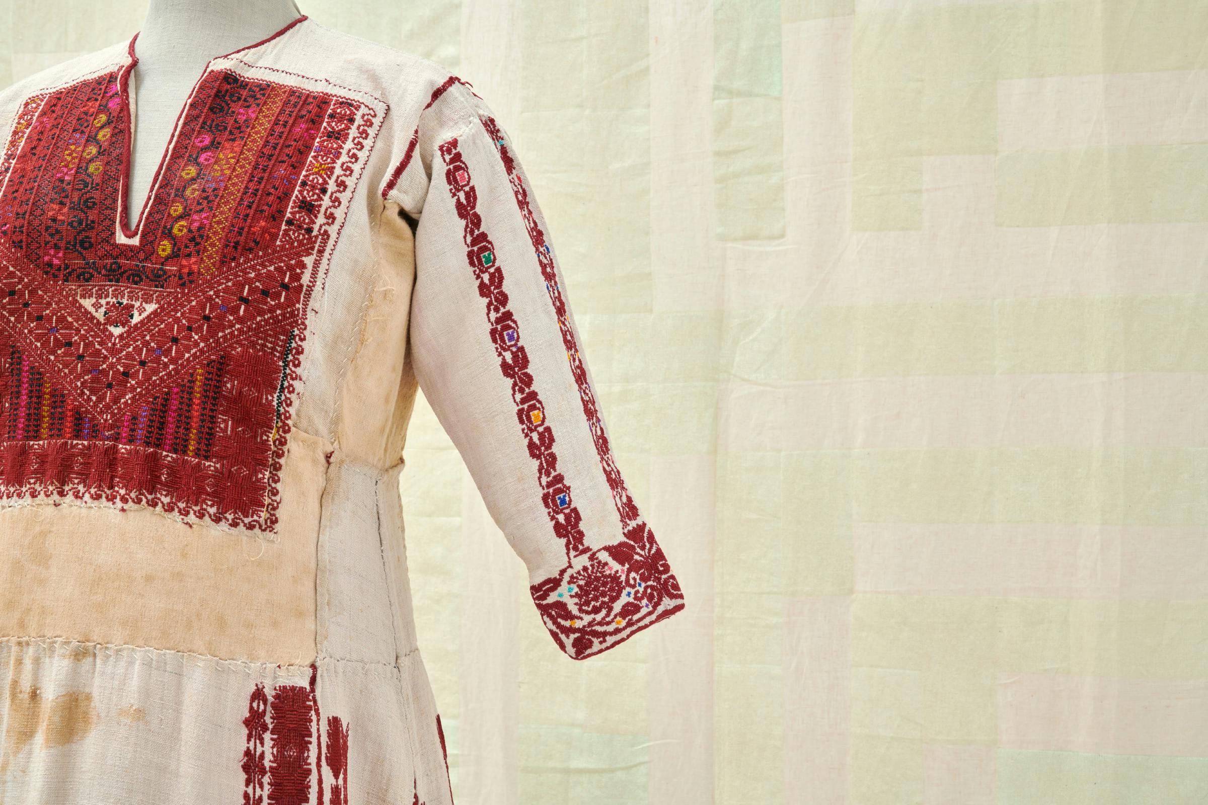
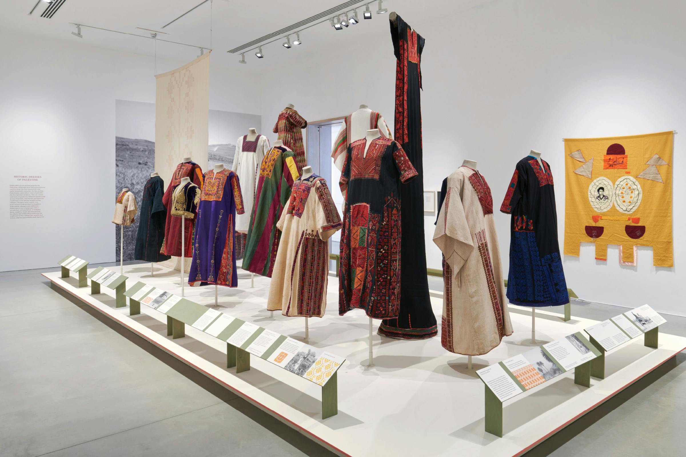
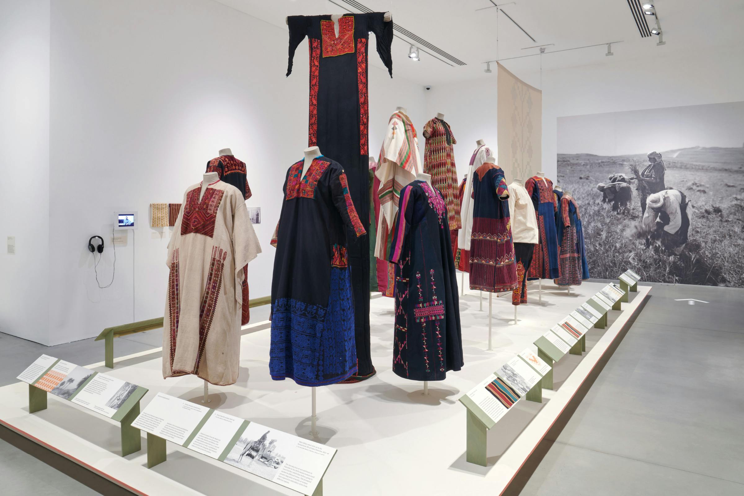
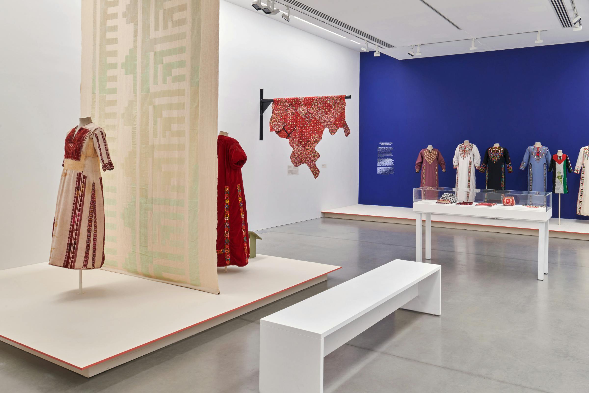
This ancient and beautiful practice remains an important living tradition and the most prominent cultural material of Palestine today. Every dress tells a story: whether about the lives of women with their astonishing skills and creativity in the early decades of the last century, or the trauma of displacement as a result of the war of 1948.
The exhibition design plays with natural materials, relief, and bold highlights. A red accented plinth to elevate the dresses above the gallery floor, with stained wood for the label holders. Printed contextual imagery on recycled board. Dusky coloured label paper. Large-scale environmental supergraphic imagery. Warm-toned painted walls and a striking indigo backdrop.
Client
Kettle’s Yard
Category
Exhibition
8 July – 29 October 2023
Curator
Rachel Dedman
Assistant Curator
Eliza Spindel
3D Design
Wolfe Hall with Kettle’s Yard
Typefaces
True Sans, True Serif
Photography
Jo Underhill
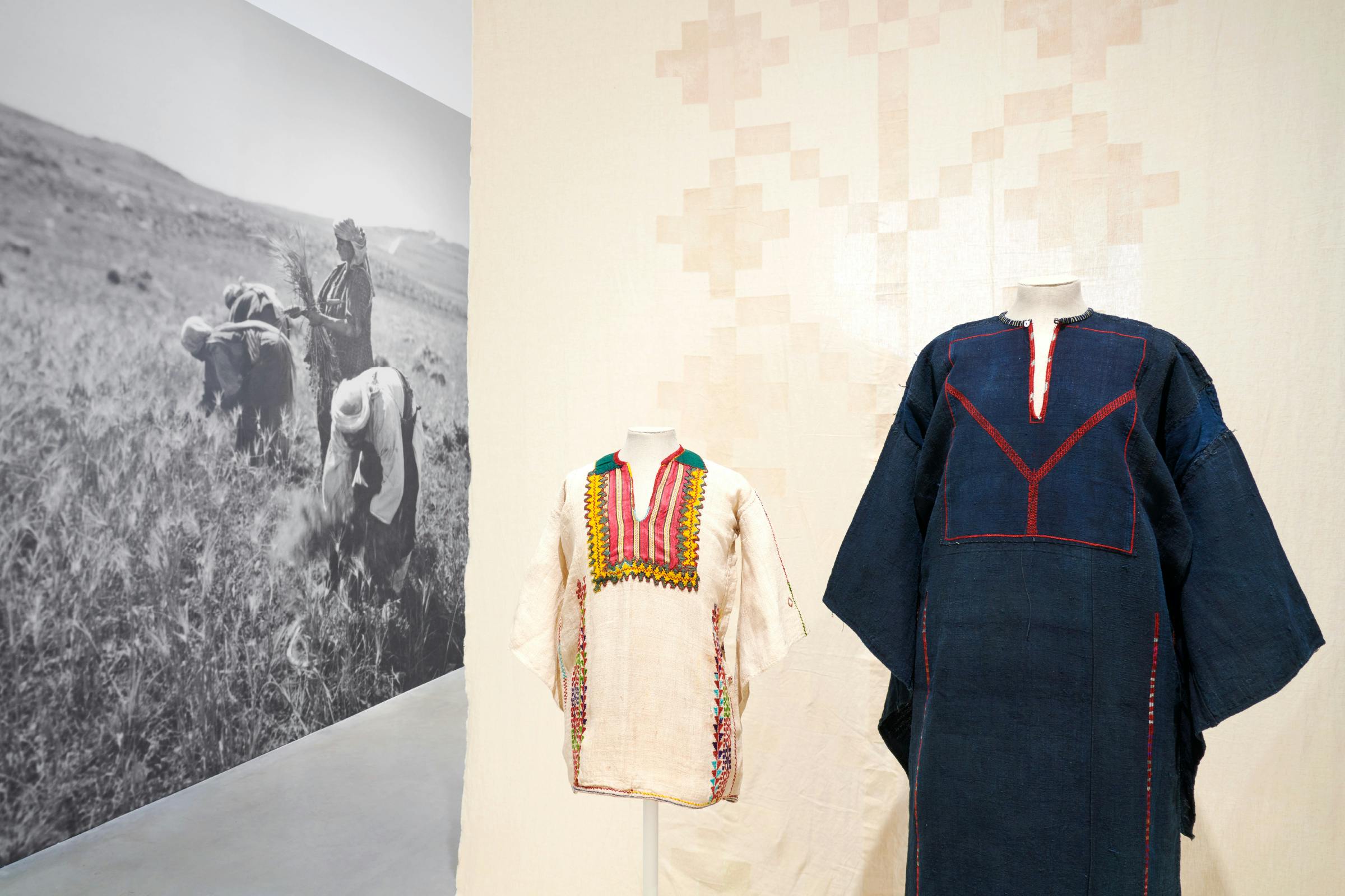
A pair of woodblock-printed, patterned, fabric hangings are used to create an intervention within the two galleries. These form large-scale tactile dividers that boost the colours of the garments placed in front of them.
The printed patterns simplify motifs found in key works on dresses at the entrance of each room, and play with the show-through of the lightweight cloth to allow the decoration to appear on both sides.
There are two voices portrayed throughout the exhibition, the historical and the contemporary. The interpretation is set in True, a type family by the foundry Bold Decisions that is made up of a sans and serif style, of which we have switched between the two to communicate this differentiation.
The letterforms in True aren’t a revival of any historical model, but instead play on the idea of memory. Borrowing regional shapes and temperament to create letterforms with plenty of character.
The marketing campaign explores the graphic language found within the embroidery. From delicate patterns through to bold motifs, merging imagery found in several of the key works into a shifting textured background that travels across the background. Each pattern tells a story or has a symbolic meaning.
Printed in close hues of orange and yellow, the pattern forms a bold background to a variety of historical imagery on the printed materials. The scale is maintained across each of the required print sizes, so that each element could tile together to create a fully formed layout of shifting ornamentation.