PUP Architects Identity
PUP is a London-based design and architecture studio specialising in socially and environmentally conscious architectural projects, with a reputation for having a positive design ethos which is critically engaged with the discipline and the world around it.
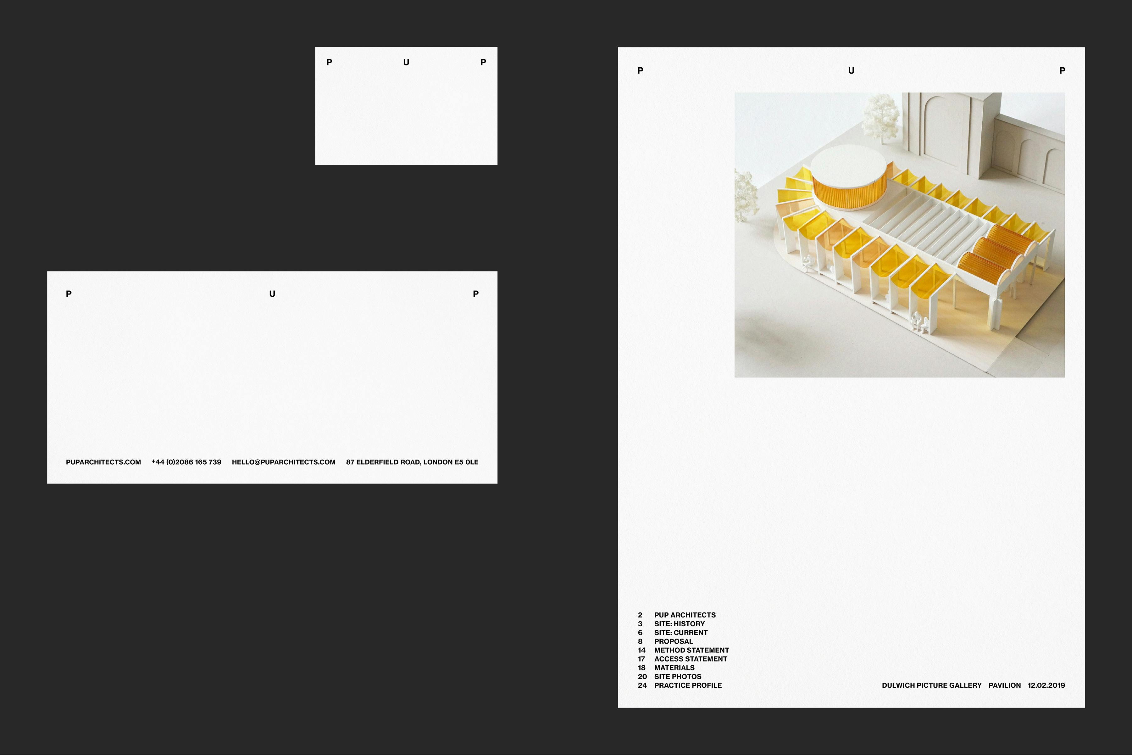
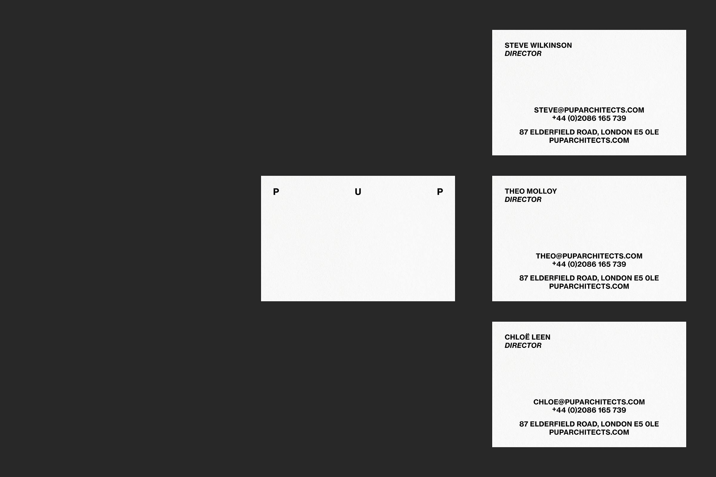
We worked with PUP to create their visual identity, utilising the three capital letters of their name as a way to react visually to the given space on different documents.* Shaping and dividing area in relation to the practices name.
The website continues the ‘office’ aesthetic, utilising lines to create spaces for imagery and information. Framing content to draw attention to details and create narratives for each project.
Background colours can be adjusted to suit each project, working through a series of light tones that give a rhythm to the carousel.
News articles are positioned typographically for a degree of separation, working as a link to a press page or external link.
Website
Development
Kieran Startup
Project pages are built as adaptable layouts to give narrative to the content. Starting with a 1/4 size side bar of text information and specifications, and a scrollable 3/4 size area for imagery and exposition.
The exposition area is adaptable in the back end of the website, allowing PUP to adjust image size – large, medium or small – and position in the layout – left, right or central. With capacity for individual text captioning.
Clicking an image expands a carousel to view the imagery as large a possible, also allowing for extra contextual imagery within this carousel that isn't part of the main page.
The project menu, practice and press menu pages split the screen in half, using an adjustable table and highlight image to allow a user to explore the content. Colour highlights can also be applied to the article as on the home page.
Press articles can be links to external sites, or have the capacity to host live text, image carousels and footnotes.
The letterhead provides the structural basis for A4 documentation. Creating a grid that can be easily switch between for letters, invoices, quotations, imagery and longer text documents.
The studio has a range of coloured papers that could be used within their printed output, allowing them to react to the type of job at hand. A warm white for more serious output, and a green or pink for more playful work. A neutral black text helps to elevate imagery.
* Titles and headers are set in Neue Haas Grotesk Text 75 Bold, a heavy-weighted revival of the Helvetica predecessor. Body text is set in Rotation, giving a warmth to the visuals as a counter to the all caps styling of the identity. Combined, they are reminiscent of office stationary and product catalogues from the 1960s.