Royal Academy of Dance Identity

A complete rebrand of the Royal Academy of Dance (RAD) celebrating the institution’s centenary, centred around a bespoke typeface that embodies the past 100 years of heritage in a forward-looking and contemporary fashion.
The RAD was born from a meeting of eminent European dancers in 1920 in London: Phyllis Bedells (English Method), Lucia Cormani (Italian Method), Edouard Espinosa (French Method), Adeline Genée (Bournonville Method, Denmark), and Tamara Karsavina (Imperial Method, Russia), arranged by the then editor of the Dancing Times, Phillip Richardson.
At dinner they discussed the poor quality of training in Britain, and how, together, they could create a thoroughly modern approach.* A goal that influences the organisation to this day.
Selected as ‘in book’ for type design at the Tokyo TDC Annual Awards 2023.
Rather than creating a completely new style, the founders sought to build upon and modernise traditional methodology. The identity takes the same approach, building upon the classical with modern techniques to evolve traditional methods into something contemporary.
To unify the large variety of ephemera that the school produces, a brand new typeface has been developed to create a strong visual identity through all elements. One that can be both serious and playful through careful detailing that reveals itself at larger type sizes.
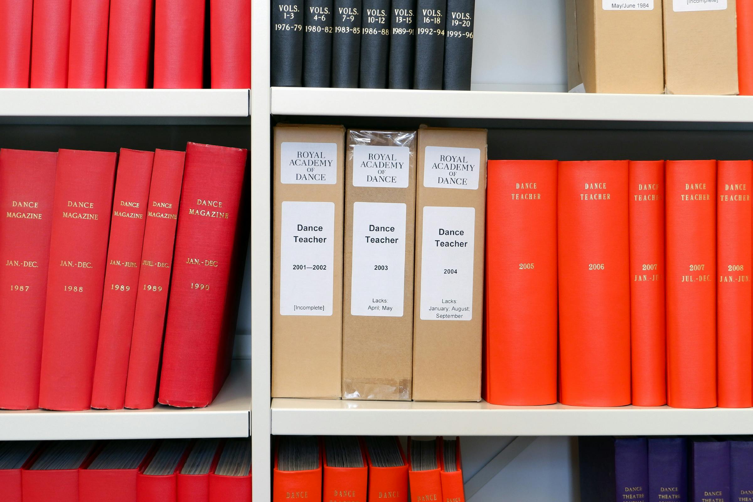
After spending time in the RAD archives, we discovered a remarkable collection of early printed ephemera from the starting decades of the school, collected together in several extensive volumes by the first secretary of the institution. Containing everything from adverts to handbooks, members cards, posters, and the original royal charter for the coat of arms. All brightly standing out through the continuous use of a strong red accent colour.
These artefacts from a century ago provided a glimpse into the early ambitions and direction of the school. A playfulness of arrangement and composition is present in a lot of this early output, which use a variety of serif typefaces.
There were numerous international explorations into the idea of a ‘modern’ serif during the 1920–30s, pushing away from letterforms that were originally created for renaissance printing machines and starting again with calligraphic forms – the presence of the hand – a way of giving lettering a sense of freedom.
The letterforms have a range of angles that give a strong feeling of movement with fluid, tapering points that can also be found within the re-drawn coat of arms.† A large lowercase x-height helps give it an open, contemporary feeling, whilst also aids with legibility at small sizes.
As a further nod to ballet, the typeface includes an ‘En Pointe’ Opentype mode, that elongates the ascenders and descenders of the lowercase letters – as if the letters are standing tall on tip-toes with arms held high.
A range of alternate stylised characters can also be drawn upon for decorative titles and to create secondary logo forms for events.
The typeface is complimented by a lighter sans serif body text that echoes the shapes found in the serif.
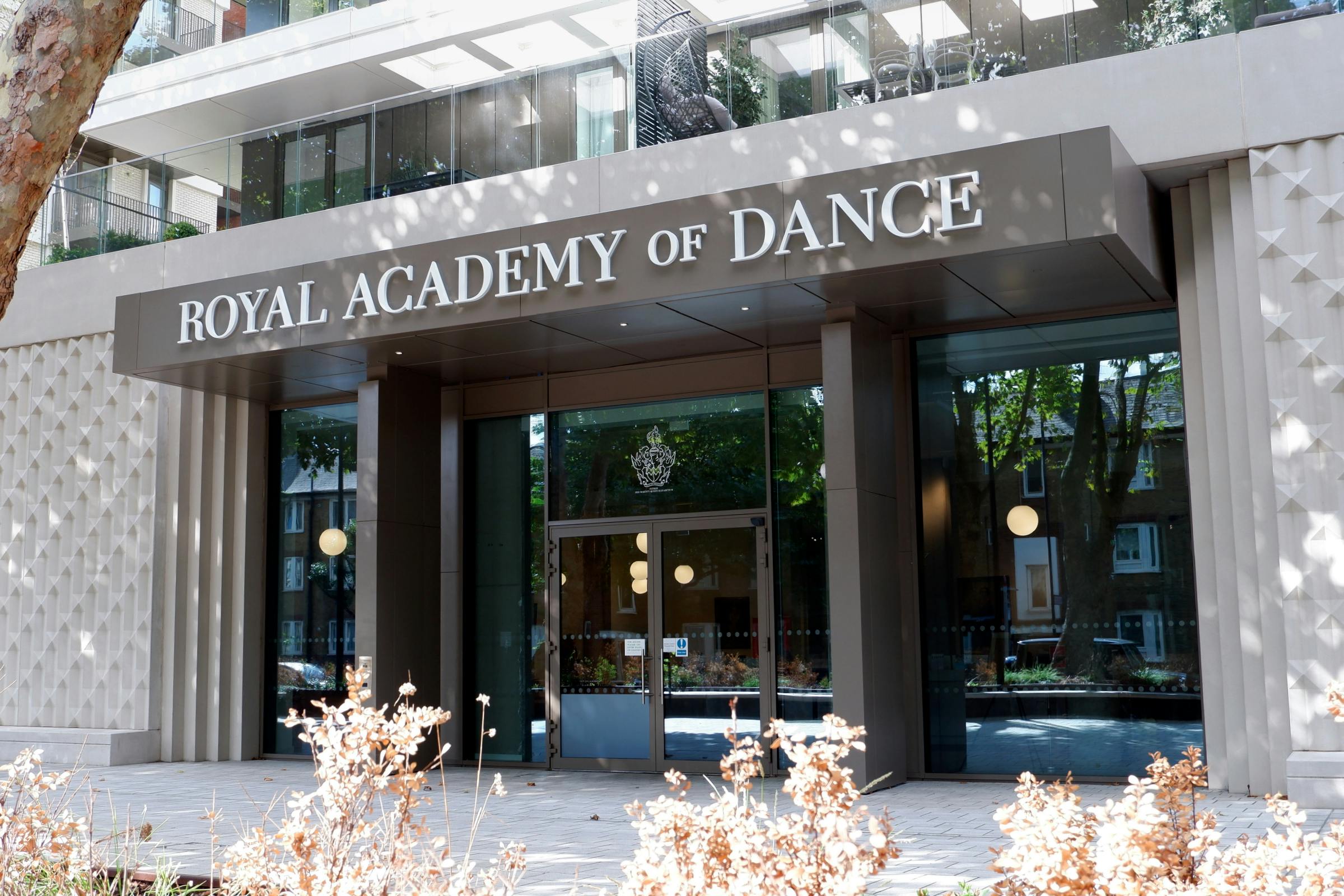
Signage and wayfinding was created to compliment the internal architecture of the new RAD headquarters, designed by Takero Shimazaki Architects (t-sa). The materials of which are deliberately delicate-feeling – with highlights of bright red to create moments of drama for key rooms.
The external signage was kept simple to not fight against the decorative facade. Using white on tinted windows to draw attention to entrance points, and subtly backlighting the bold title sitting on the front canopy.
Inside, bright-white powder-coated letters with red pin-mounts draw attention to the main studio theatre. Utilising cast shadows from the raised lettering to create a strong highlighted contrast to the warm-white wall.
This language of physical letters evolves for the studio rooms, with charcoal powder-coated aluminium characters fixed above the doorways.
Protruding signs highlight rooms that are approached from longer corridors, allowing visitors to easily navigate the building.
Wayfinding points are positioned throughout, with playful, elongated arrows to help guide visitors around corners.
There is a strong attention to detail throughout the scheme, ensuring that the visual language of the identity is used even on the most basic of operational signage.
* This desire to modernise led to the formation of the ‘Association of Teachers of Operatic Dancing of Great Britain’, and later the ‘Royal Academy of Dancing’ after they were granted a Royal Charter by King George V in 1935. Presently, the RAD are one of the largest dance schools in the world, with sites in over 50 countries.
† The coat of arms for the Royal Academy of Dance was granted by the College of Arms in 1937, designed by the Hon. George Bellew, Somerset Herald of Arms and Registrar.
The crest at the top of the coat of arms is a figure of Terpsichore, one of the Muses from Greek mythology, representing dance. The supporter at either side of the shield is a winged doe, symbolising lightness and grace of movement. The Escutcheon shows a pentagram symbolising health, with a wavy and zigzag line conveying the movement of dancing. The motto ‘Salus et Felicitas’ translates to mean health and happiness.